If you’re searching for the best WordPress slider plugin for your site, you’ve probably come across the name Slider Revolution. Not only is this popular slider plugin bundled with what seems like every single theme at ThemeForest, but it’s also incredibly popular in its own right.
It’s been purchased an astounding 366,000+ times, which makes it by far the most popular slider plugin sold at Envato’s CodeCanyon marketplace.
Perhaps more importantly, though, it’s also maintained a 4.77-star rating (out of 5) on over 9,300 user reviews, which is pretty impressive.
But is the wisdom of the crowds right on this one? In this hands-on Slider Revolution review, I’ll dig into the plugin to help you decide.
I’ll show you exactly how it works and highlight what I think it does well…and what it does not so well.
Table of Contents
Slider Revolution Review of the Features
People call Slider Revolution a WordPress slider plugin, but it’s almost more like a blend of a slider plugin with a page builder plugin because of the detailed editor that you get to build your slides.
You can use the visual drag-and-drop editor to build out entire hero sections or, in some cases, entire websites. You’ll be able to design each individual slide with the visual drag-and-drop editor, which gives you a ton of control.
Another powerful thing about Slider Revolution is its ability to dynamically include content. For example, you can create sliders that automatically include your latest blog posts or WooCommerce products. You can also include external content from:
- Flickr
- YouTube
- Vimeo
Slider Revolution also excels at animations. Not only do you get lots of animation styles in general, but you also get this detailed animation timeline feature that lets you set up complex animation sequences within the same slider.
Other standout features include:
- 200+ pre-built importable slide templates
- Lots of style options
- Helpful content modules, like buttons
- 20+ add-ons for new features and effects
- Media asset library
I’ll start by showing you how Slider Revolution works in general. Then, I’ll single out some specific areas where Slider Revolution performs well…or performs poorly.
How Slider Revolution Works
When you open the Slider Revolution section of your WordPress dashboard, Slider Revolution dims the regular WordPress dashboard sidebar, which creates a nice immersive, easy-to-focus experience:
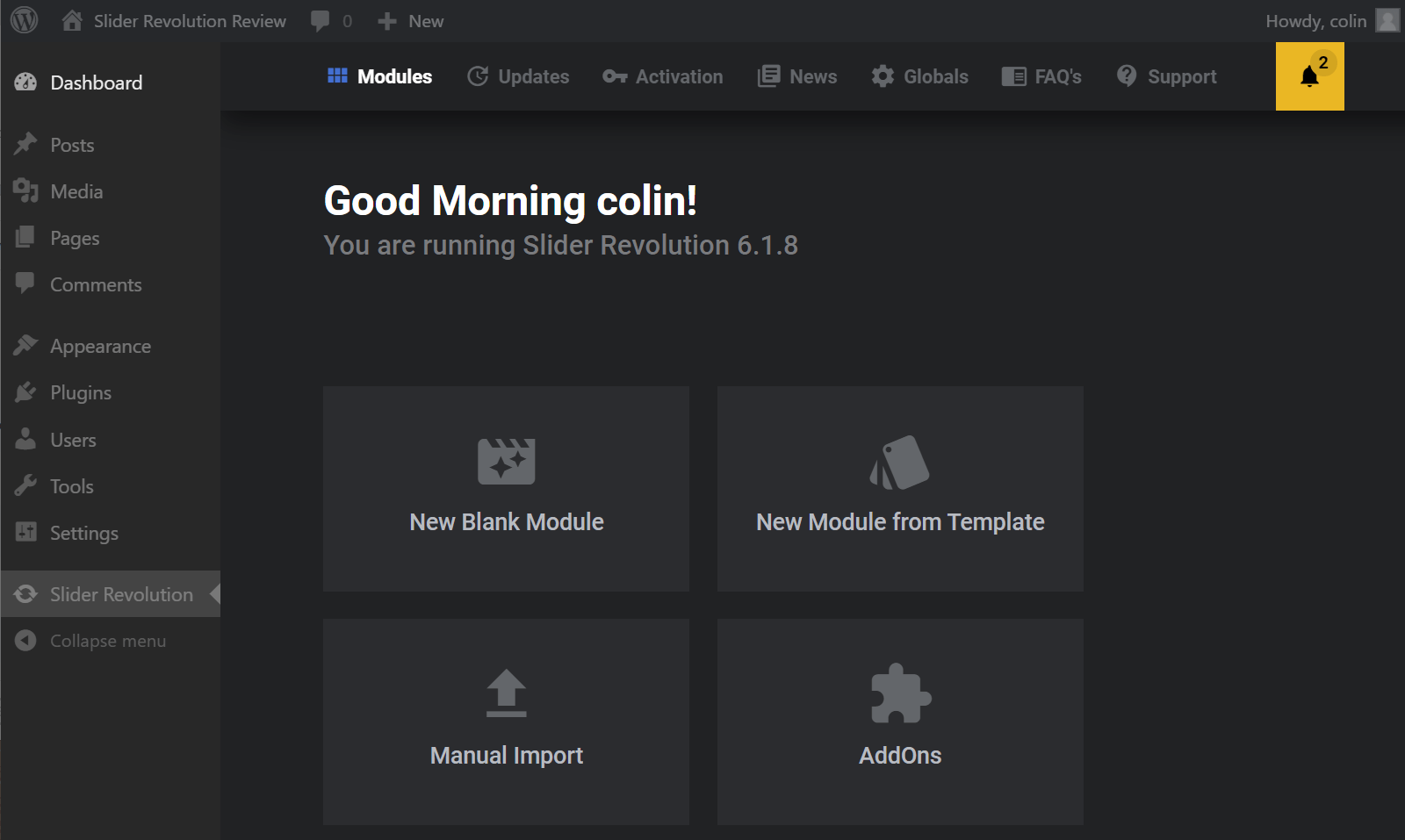
You have three options for creating a new slider:
- Start from a blank slate
- Use one of the 200+ included templates
- Manually import a slider from another site
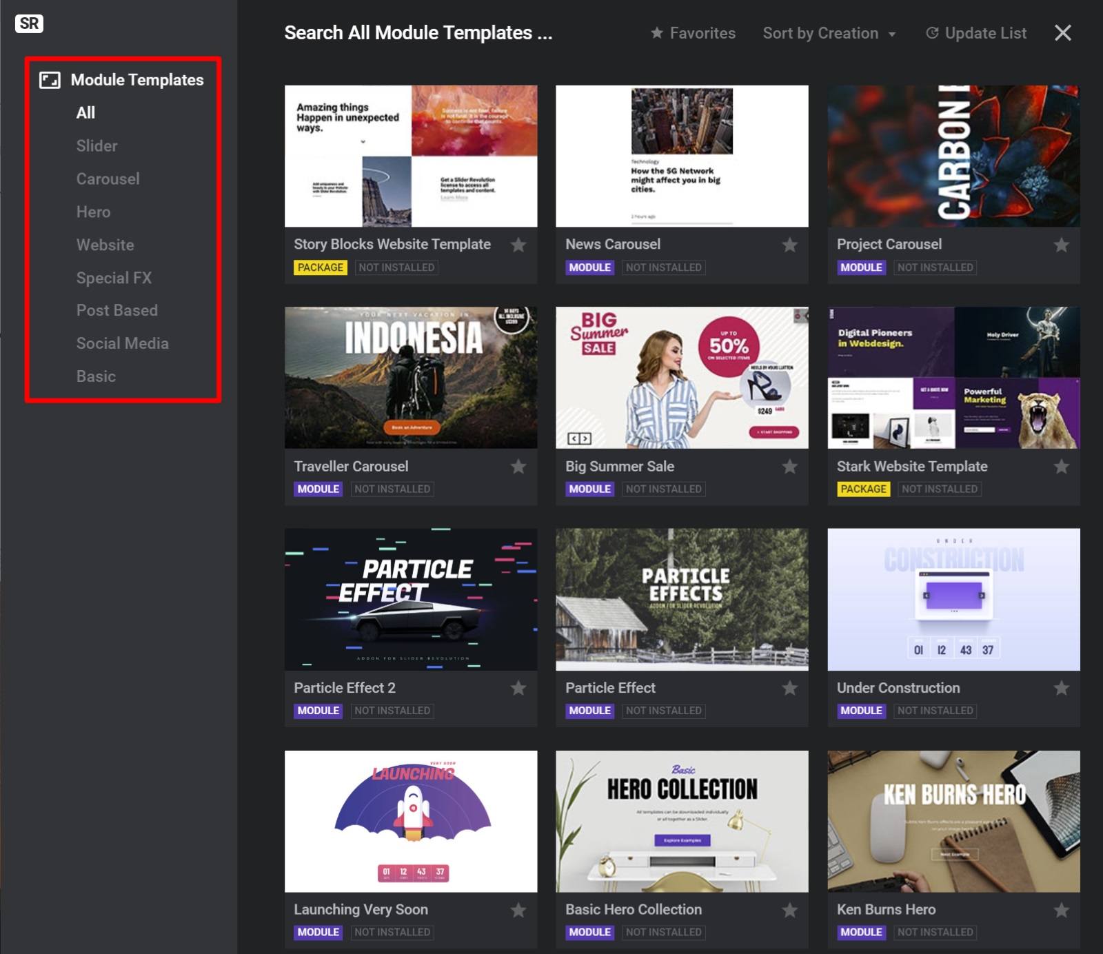
If you opt to use one of the pre-made templates, you’ll find that they’re divided into eight categories:
- Slider
- Carousel
- Hero
- Website
- Special FX
- Post Based
- Social Media
- Basic
Slider Revolution Editor
Once you create your “module”, Slider Revolution will launch you into the editor.
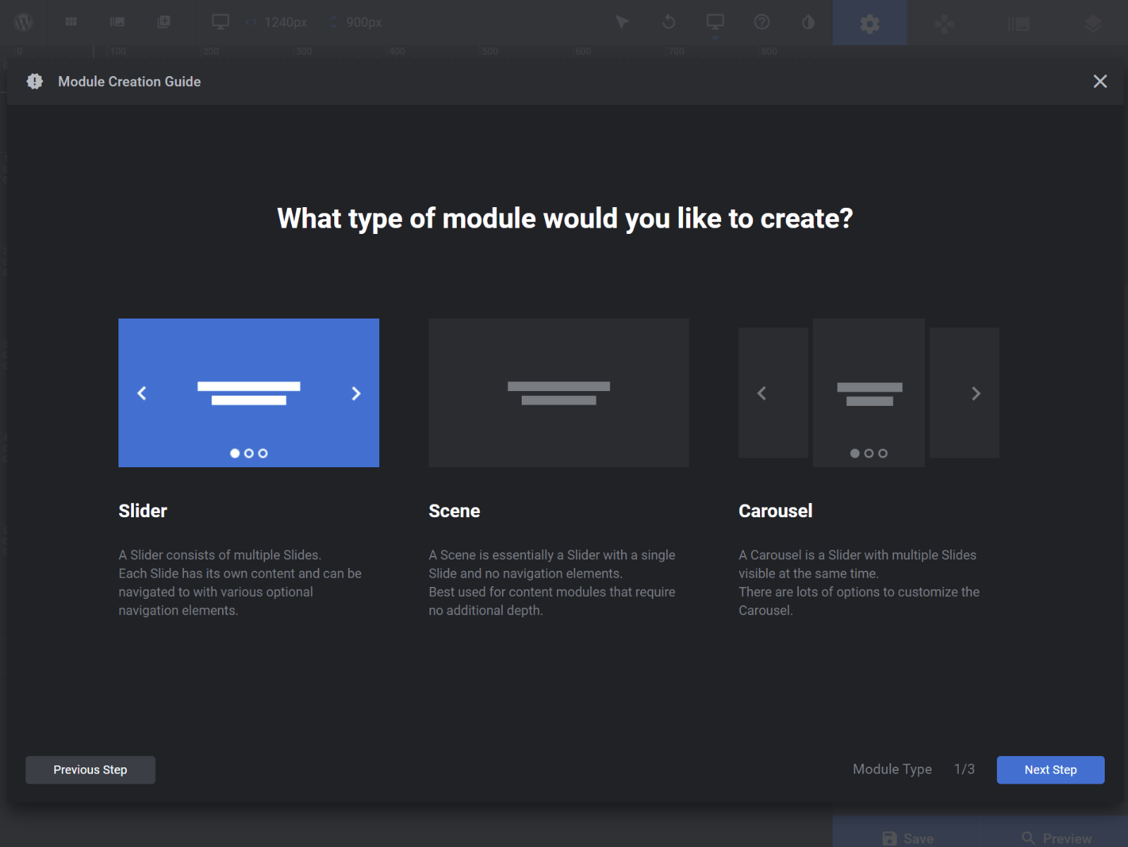
If you create a blank template, Slider Revolution includes a “start guide” to help you set up the basics, like the type of “module” and dimensions.
In addition to creating sliders and carousels, you also have the option to create a “scene”, which is almost like using Slider Revolution as a WordPress page builder because there’s only a single “slide”.
Once you set it up, you’ll see the full editor, which looks pretty empty if you start from scratch:
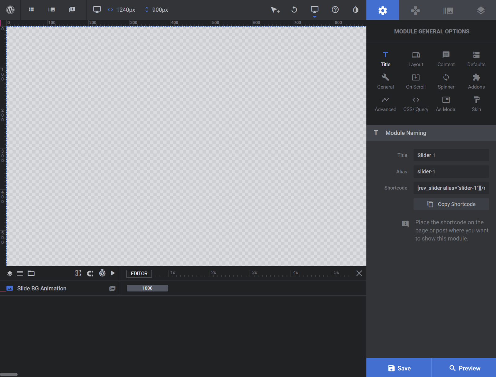
There is a ton going on here, but let me try to hit the highlights.
First, in the general module settings on the right, you can control high-level behavior. One of the most important settings is the Content options. This is where you can select a dynamic source, like your latest WooCommerce products or Instagram posts:
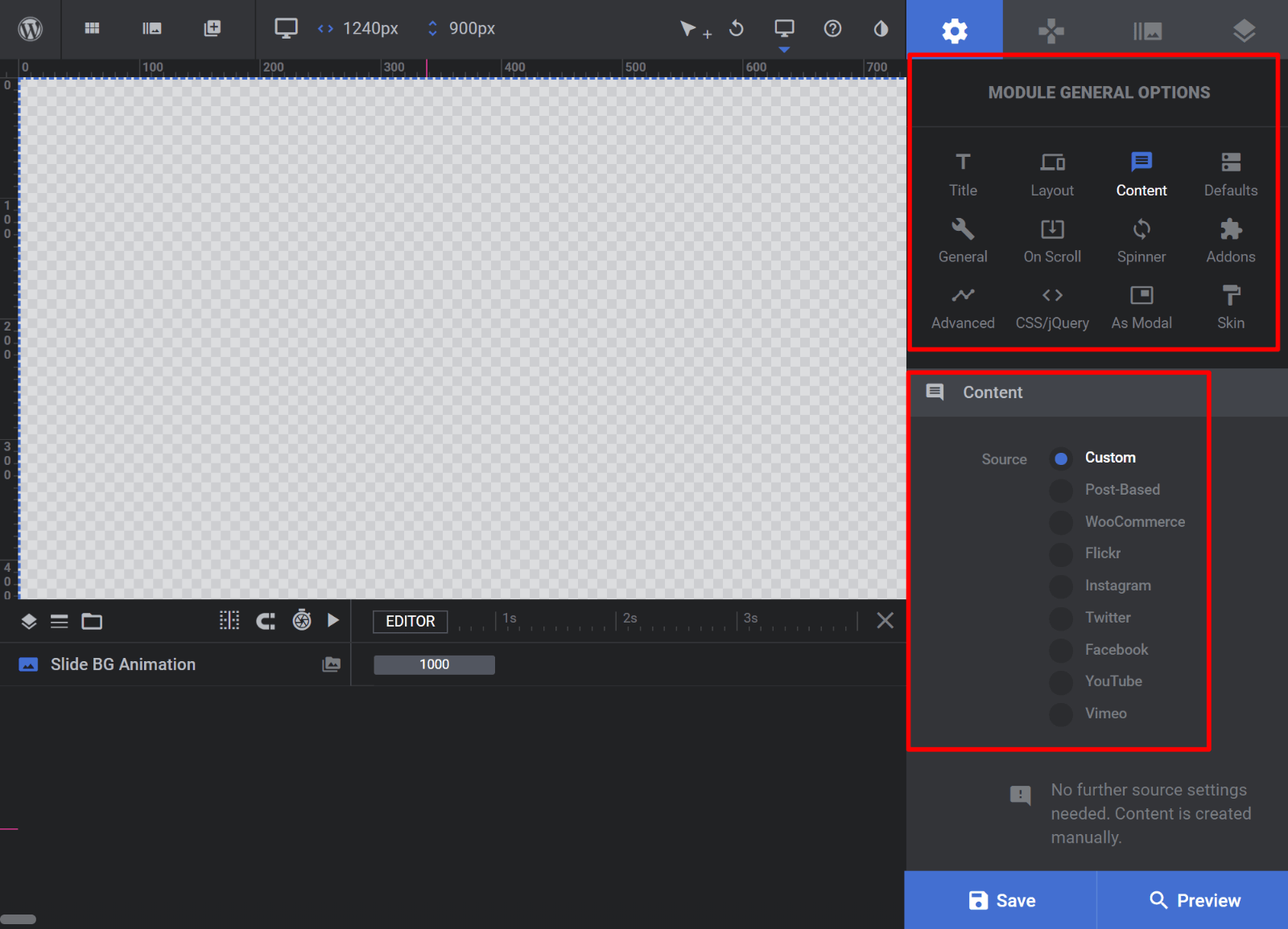
If you choose Custom content, you can just jump into designing your own content using drag-and-drop (more on that in a second). But if you choose a different option, you get lots of options to filter out specific content first.
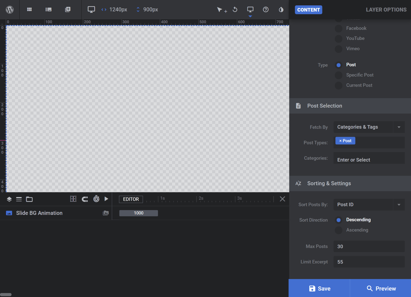
For example, if you create a Post-Based slider, you can target specific:
- Post types
- Taxonomies (categories, tags, etc.)
Adding Content
To add content, Slider Revolution uses both layers (like Photoshop) and widgets (like a WordPress page builder).
To add a new layer, you can click the plus icon in the top-left corner:
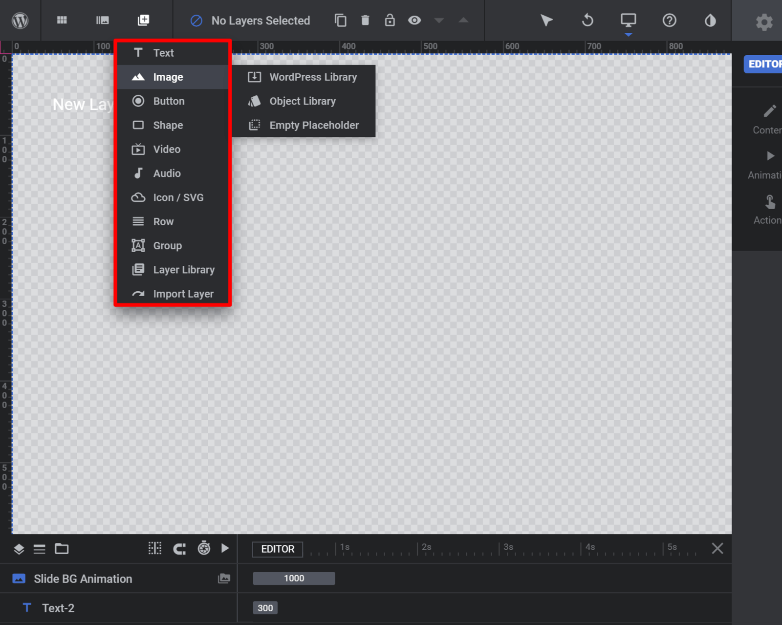
Then, you can configure that layer’s content and style in the sidebar.
For example, if you add a text layer, you can edit the text.
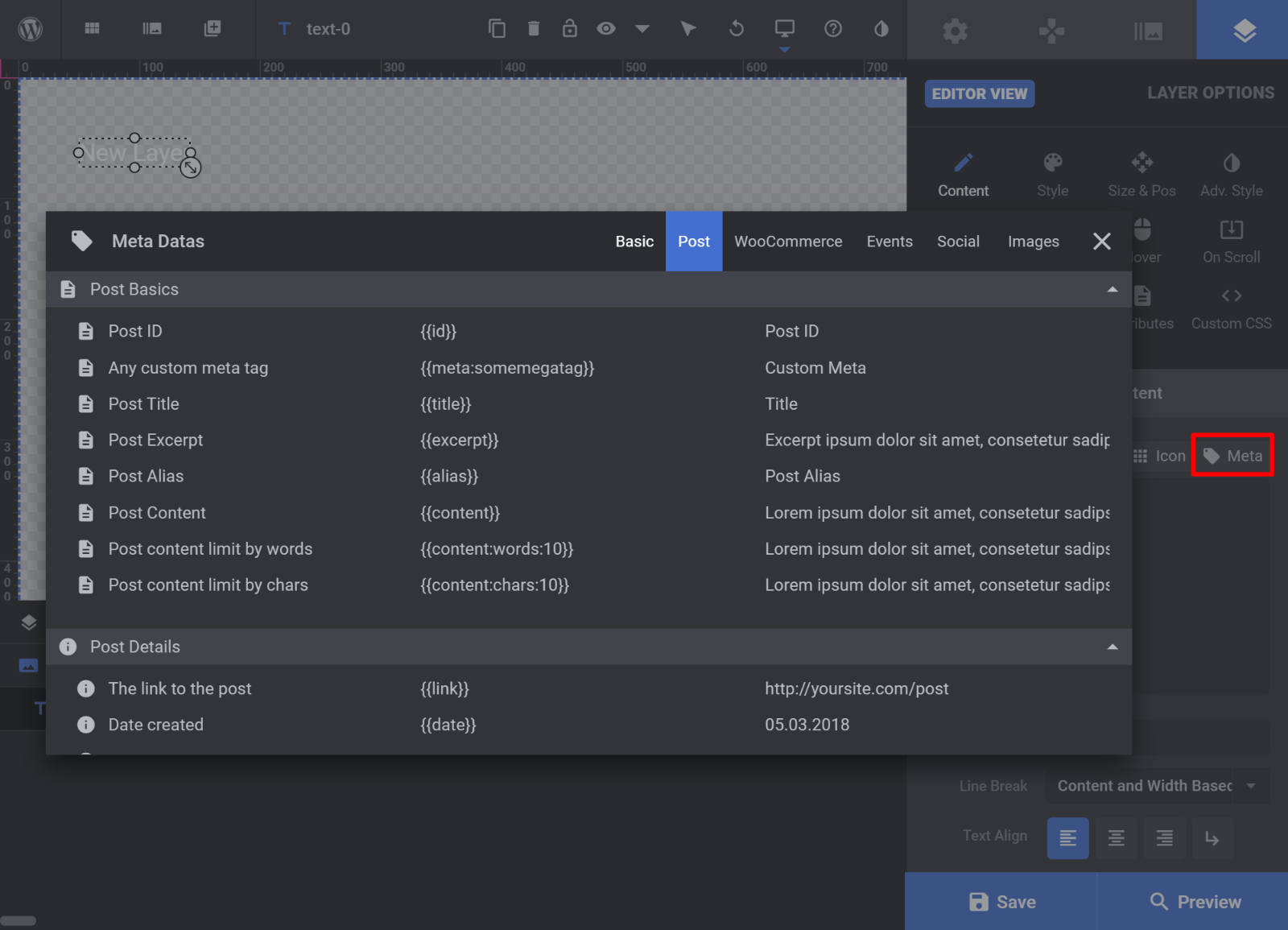
The powerful thing here, though, is the ability to insert dynamic content using the Meta option.
For example, if you’re creating a slider of your latest posts, you could automatically populate a text layer with the title of a post:
As you add additional layers, you’ll be able to arrange them using drag-and-drop. You can also use the interface at the bottom to quickly switch between layers.
This interface also helps you manage animations. If you look to the right of each layer’s name, you’ll also see how that layer’s animation fits into the timeline for the slide. You can also use drag-and-drop to change an animation’s length or start time.
And if you want to see how a slide would look at a specific point in time, you can click on the preview.
For example, you can only see the title and button in the screenshot below because the subheading entrance hasn’t arrived yet:
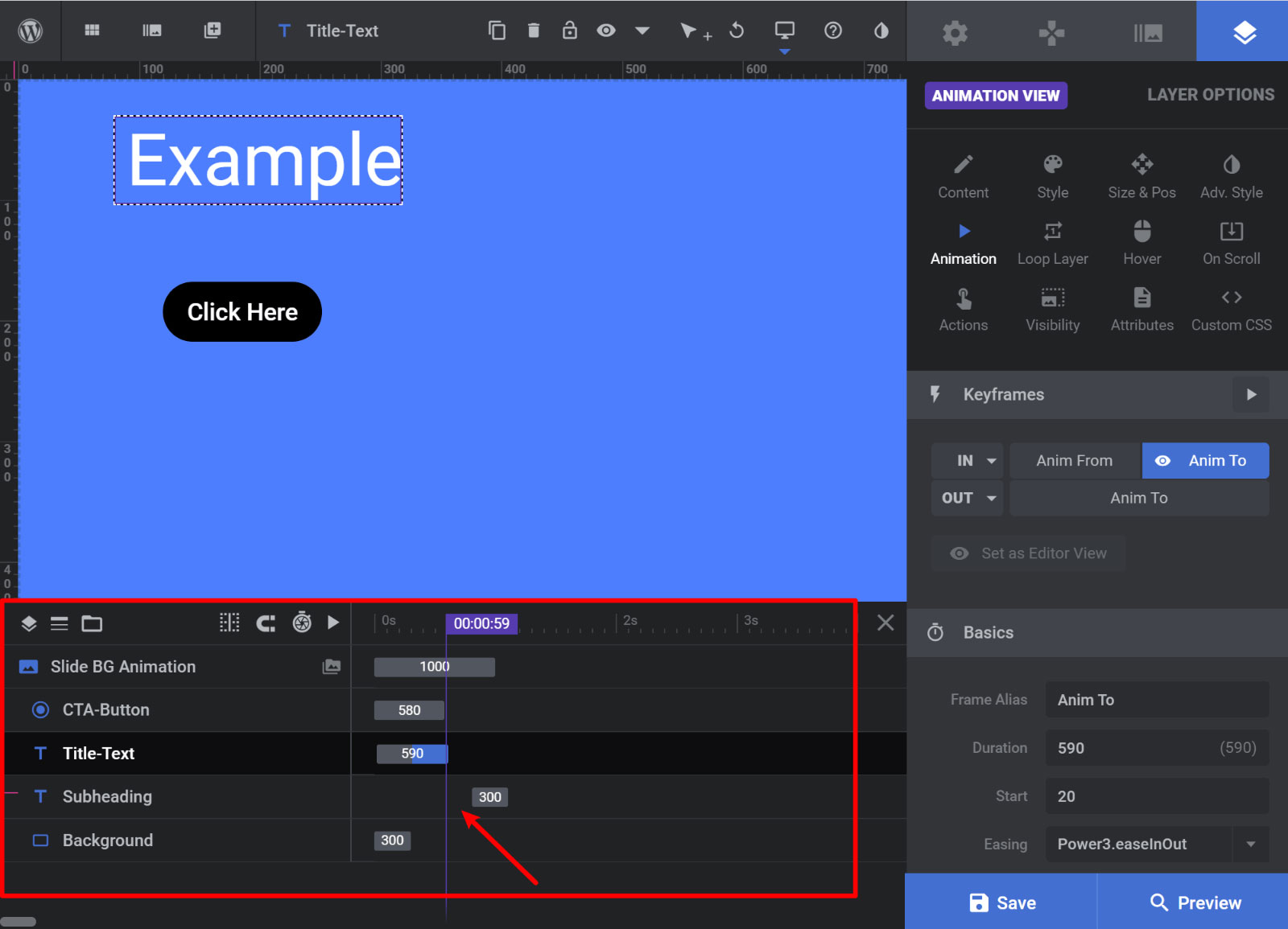
This animation management is a really powerful feature and makes it a cinch to control when elements appear/disappear and how long their animations last.
To create additional slides, all you need to do is repeat the process for each slide.
What Slider Revolution Does Well
Honestly, showing you every single feature would require a book because Slider Revolution really is just that detailed. But at this point, I hope you have a good feel for how the interface works.
Now, let’s highlight some highpoints and low points.
So. Many. Features
First, I just want to highlight again the sheer depth of features, as this is one of the biggest things Slider Revolution does well.
You have control over pretty much every single detail on your slider, which is a big advantage all by itself.
You just plain won’t find many WordPress plugins that offer this level of depth and control.
Dynamic Content
You can choose from a variety of dynamic content sources and also easily insert specific data into individual layers on each slide.
This gives you a lot of flexibility for how and where you use Slider Revolution.
For example, eCommerce stores can use Slider Revolution to showcase their products, while fashion bloggers could use it to showcase their latest Instagram posts.
Visual, Drag-and-Drop Design
Much like a WordPress page builder, you can design each slide using a visual, drag-and-drop editor. This gives you a lot of flexibility for creating complex designs.
The main difference, though, is that Slider Revolution uses separate layers, like how photo editors like Photoshop work.
Animation and Timing
The layer timeline and detail animation settings are a huge strong point. Not only do you get a ton of options, but the timeline feature also makes it easy to change things up and visualize how all of the animations come together.
I also love how you can preview your slide at a specific point in time.
Responsive Design Settings
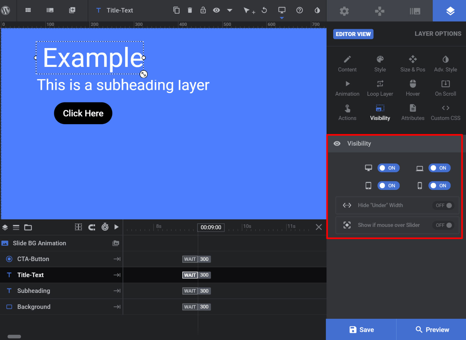
I didn’t cover this above, but another great thing about Slider Revolution is that you get responsive design settings to control how your slides behave on different devices.
You can even hide individual layers on certain devices or for your own custom breakpoints:
Media Library
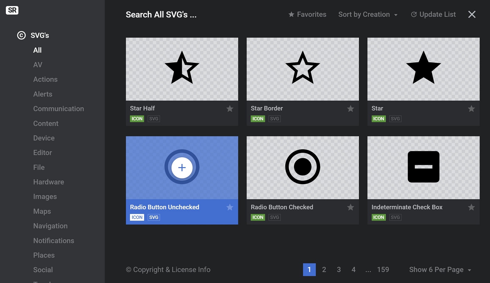
Another feature that I didn’t show you before is the huge media library that you get access to. You can easily insert an array of SVGs and font icons right from the Slider Revolution editor, which is quite convenient:
Add-Ons
Finally, Slider Revolution also includes a set of 20+ add-ons that you can use to add even more functionality. These add-ons are included with your purchase of the plugin, but they require a license key to install.
These extensions add new content options, like a login page, as well as new styles/animations, like particle effects.
Here’s the full list:
- Domain switch
- Paintbrush
- Exploding Layers
- Distortion
- BubbleMorph
- (Re)Load
- Reveal
- Duotone
- Panorama
- Weather
- Before & After
- Slicey
- Post Featured Slider
- Login Page
- Filmstrip
- Adjacent Posts
- 404
- Polyfold Scroll Effect
- Particle Effects
- Holiday Snow
- Coming & Maintenance
- Social Sharing
- Typewriter Effect
- Related Posts
- WordPress Gallery
- Backup
- Whiteboard

What Slider Revolution Does Poorly
There’s a lot to like about Slider Revolution, but it’s not perfect…
Here are the two big downsides.
Performance
The main area where I would fault Slider Revolution is performance. The tradeoff for all of those advanced features is that Slider Revolution is a little heavier than some of the more lightweight competition.
For example, I created a simple test with some basic image sliders comparing Slider Revolution vs MetaSlider, a more lightweight slider plugin. Here’s how they fared when it came to page size and HTTP requests:
- Revolution Slider – 906 KB and 23 HTTP requests
- MetaSlider – 588 KB and 24 HTTP requests
Now, you might value the flexibility and features more than the performance aspect, which is totally fine. Slider Revolution is much much much more flexible and customizable than MetaSlider, so MetaSlider also has big tradeoffs to achieve that performance.
Additionally, Slider Revolution has improved a lot from where it previously was, so I hope that the team behind the plugin can continue to improve from a performance perspective.
Overwhelming Interface
While the huge array of settings and customization options give you detailed control, they’re also a bit of a double-edged sword in that they also make the Slider Revolution interface quite complicated.
Now, I think Slider Revolution has made some improvements to the interface to make it more user-friendly (you can see what it used to look like in our Slider Revolution vs LayerSlider vs Soliloquy comparison).
Still, it’s definitely overwhelming and there’s a bit of a learning curve before you can start harnessing all of its features.
If you don’t need all those advanced features, I would stick with one of the simpler options.
Who Should Use Slider Revolution?
Slider Revolution is great for designers, website builders, or power users who want to really dig in and customize everything about their sliders and carousels.
If you want to create that pixel perfect design, you’ll love that Slider Revolution lets you control everything down to the pixel.
Additionally, calling Slider Revolution a “slider plugin” is a little inaccurate because it does a lot more than most of the slider plugins that you’ll find at WordPress.org and elsewhere.
You get drag-and-drop page builder levels of control over each individual slide, which is tough to beat from a flexibility perspective.
Who Should Skip Slider Revolution?
This section is kind of the opposite of the previous section, but I think it’s still worthwhile to go over again so that you understand whether or not Slider Revolution is right for you.
In everything above, I hope I’ve communicated that Slider Revolution comes with a ton of features to help you build custom sliders.
Now, that’s awesome if you want those features, but it also makes it a little bloated/overwhelming if you don’t.
If you’re just a person who wants to, say, create a simple slider of static images, Slider Revolution is way overkill for your needs.
You’re going to spend money unnecessarily to get access to a bunch of features that you don’t need. Additionally, you’re going to feel overwhelmed trying to figure out the Slider Revolution interface just to create a simple slider.
Instead, I’d recommend going with one of the lightweight free slider plugins at WordPress.org, like MetaSlider.
Final Thoughts & Pricing
Slider Revolution is sold for $29 at Envato’s CodeCanyon marketplace. It uses standard Envato licensing which means that your purchase gets you access to:
- Lifetime updates and template access for a single site
- Six months of support (extendable to 12 months for an additional $9)
Overall, I’d say that Slider Revolution is a heavy-duty plugin for heavy-duty users.
If I were recommending a WordPress plugin to my mom to help her create a slider of her vacation photos, it wouldn’t be Slider Revolution because the interface is just way too overwhelming.
But if I were recommending a slider plugin to my friend Ted who’s been using WordPress for five years and wants to showcase products on his WooCommerce store, then I would say Slider Revolution is definitely worth checking out because of its huge array of features including:
- Dynamic content sources
- Visual drag-and-drop editor
- Animation timeline
- Detailed style options
If you want to see some other options, we also have a collection of the six best WordPress slider plugins, which includes Slider Revolution.
Used/using Slider Revolution? Thoughts?
Related Posts:
Discover more from WPMarmalade
Subscribe to get the latest posts sent to your email.



10 Comments
It’s so unnecessarily complicated, you set it up to look one way in the back and out front it looks completely different.
When you have a problem, you go to support, every support ticket you open (no matter how small the complication) they want your admin login details.
I’ve been using this plugin for years, it’s been like this for years and it’s as bad as it ever has been. The only reason I use it is because it’s packaged with the themes I purchased and it’s a “required plugin”.
NOT HAPPY: I wasted money upgrading to the Pro version, and unfortunately I didn’t really test it out until after the trial period. I agree with others, it is bloated, buggy, unintuitive, un-user-friendly, difficult to use and overly complicated. So I’m pretty unsatisfied because I have paid for and uninstalled this plugin.
Absolute waste of time!
I have used the previous versions with much, much more success…the current one is bloated, buggy and unintuitive!
If it was not included in literally all themes on Themeforest I would never use it!
It is not centered most of the times, the animations are a feackin nightmare to deal with and god forbid you need to undo something…it is a complete toss up what will be undoed…
Terrible, terrible release!
I’ve worked on a few sites with Slider Revolution and I absolutely hate it. How it has so many positive reviews is beyond me.
To me, it feels overly complex and unintuitive. Maybe it’s one of those things you need to really sit down and learn but it just doesn’t seem worth it to me.
I had an issue with it on a site and the devs needed admin access to the site to fix the problem. Which isn’t really an issue but they were very secretive about what they did to fix it and how to prevent the issue in the future. I don’t trust anyone that needs admin access to a site but won’t tell me what they are doing.
Honestly, the most difficult plugin that I have ever worked with. I have wasted so much time with it and would not recommend it to anyone especially if they do not regard themselves as a web developer of sorts. Just not user friendly on a commercial basis at all.
I think yo are wrong, the user interface is outstanding, if you set up your caching correctly you can easily achieve very fast loading and the amount of control is amazing! Great for creating in house billboard animations to be driven from the internet. You just have to take about 12 months to master it and then the product is oustanding!
DON’T BOTHER WITH THIS PLUGIN! Like the two comments above, I’m having the same exact issue with Slider Revolution and I no longer recommend it to anyone. I’m just echoing with what the two persons above already said: the plugin isn’t user-friendly at all.
It has no mobile responsive option. That means you have to manually set different font sizes and rearrange portions of your project. That seemed easy at first until you realize the changes you make to your “mobile version” also reflected to the desktop version and you have to fix it over and over again. Adding to the fact that preview doesn’t actually show what the slide really looks like so when you save your changes and look at your webpage, you’ll notice some elements are awkwardly placed. There’s also no obvious way to align elements without the tool jumping all over the place causing mishaps and more fixing. I probably spent more time fixing my slider than the rest of my website.
The new UI overhaul is extremely confusing and complex. I’ve been using this plugin for almost 6 or so years and have been familiar with the previous layout. The new layout is not user-friendly at all. I thought I could skip that problem by using a template but now, the developers charge a subscription to even unlock “free” templates (which I don’t recall was the case previously). If your purchased theme comes with Slider Revolution, you still have to buy a license key from Slider Revolution in order to use any of their non-premium templates.
I’ve uninstalled this plugin because I found out that there are other options available and I don’t need to keep using this overly complicated plugin which is basically re-learning a whole new app on its own (which is insane).
I think you are off track and the new version is so much better once you master it. The improvements to speed recently make SR much faster and if you setup your caching correctly the footprint is halved! I have no idea why you would use it on Mobile anyway so it is easy to just configure an alternate static image when viewing on mobile. (although it works on mobile also). Yes when setting up complex animations and slides it can be a pain to get different screen sizes correct but it is also like this with designing just normal webpages at times. It is complexed and it should be! for what it has to offer…but you can always use a basic slider plugin if all you need is basic sliders, This is not just a basic slider it is a powerhouse and thus complexed at times. Worth every cent if you take the time to learn how to use it correctly. It is not for simple sliders, thus you should buy a product like meta slider if that’s all you need.
This must be one of the worst WordPress plugins I have ever come across.
First of all, it is not responsive, so forget about it if you want to use it on mobile.
Secondly, the user interface is over-complicated and utterly useless, on the preview, it looks completely different to what it looks like on the real thing so there is no way of getting the image just the way you want it.
On editing my slider, the plugin totally screwed up my header and I was unable to get the old version back as there is no undo button, furthermore, you can’t edit the shortcodes so you are stuck with it if you don’t want to use it anymore in the final version.
This plugin is a waste of money and wasted me hours of time.
Sliders are not new things, they have been used in Web Development for quite a while now, so to make such a mess of it is an achievement. Furthermore, having the audacity to charge people for this is an insult to any web developer who happens to have the misfortune of coming across it.
The developers of this plugin should do it and anyone who happens to use it justice and just scrap it and start from the beginning.
I’ve used Slider Revolution for several years and have always had good luck with it. Until version 6. SR6 is a huge overhaul from previous versions. On first glance, the user interface is a vast and overwhelming cornucopia of options. It meant going back to square 1 to learn how to make it work for me. It’s impossible to start out up-and-running. I assumed that once I got over the initial re-learning curve, I’d be all set. That turned out to NOT be the case. I’ve wasted many, many hours trying to make sense of the interface, but I’m barely any further along. That cornucopia of options turned out to be a bottomless pit of frustration. There is NOTHING intuitive about the interface. It looks gorgeous but it’s IMPOSSIBLE to use. It’s great to have options but useless if you can’t figure out how to use them. There are a huge number of beautiful demos on the plugin’s site. I installed several of them hoping to just modify them for my use, but once you start making even small changes, it’s very easy to break the whole slider and have to start again from scratch.
And lastly, the documentation is awful. It’s VERY difficult to search it for answers to even the simplest challenges and in many cases I simply couldn’t find a solution.
I would avoid this slider plugin at all costs!