There are a ton of good drag-and-drop page builders available to WordPress users, so which one should you use for your website?
Divi, from Elegant Themes, and Elementor are two of the most popular WordPress page builders on the market.
Both products offer modern drag-and-drop user-interfaces, and a large collection of high-quality pre-made designs that allow beginners and advanced WordPress users to create stylish content and professional websites in minutes.
Divi and Elementor are both excellent solutions, but there are many important differences between them.
So which is best? Here’s an in-depth comparison considering everything you need to know to make the right decision for your site.
Let’s dig in…
Pros and Cons of each (A Quick Summary)
Divi Pros and Cons:
Divi Pros
✅ The front-end Visual Builder is gorgeous and easy to use.
✅ Thousands of high-quality designs are available via the Divi Library.
✅ Elegant Themes membership plans offer great value for money.
Divi Cons
❌ No free version of Divi is available.
❌ Third-party support is growing, but still has a long way to go.
Elementor Pros and Cons:
Elementor Pros
✅ The core version of Elementor is available free and includes many modules, blocks and layouts.
✅ It has a fast-loading front-end page builder.
✅ The block system simplifies the task of creating unique page layouts.
Elementor Cons
❌ Small buttons and text used in the page builder can be frustrating.
❌ For those with four websites or more, Elementor Pro is more than double the cost of Divi.
Table of Contents
What Do Divi & Elementor Offer?
If you’re new to WordPress, when it comes to page builders, you may be wondering what all of the fuss is about.
After all, WordPress has a drag-and-drop page builder built into it already, so why would any website owner use another solution?
While I do love the simplicity of the default WordPress editor, there’s no hiding the fact that the block editor is a basic solution: meaning you’re very restricted with what you can do with it.
In contrast, Divi and Elementor offer advanced visual editors with hundreds of settings and features.
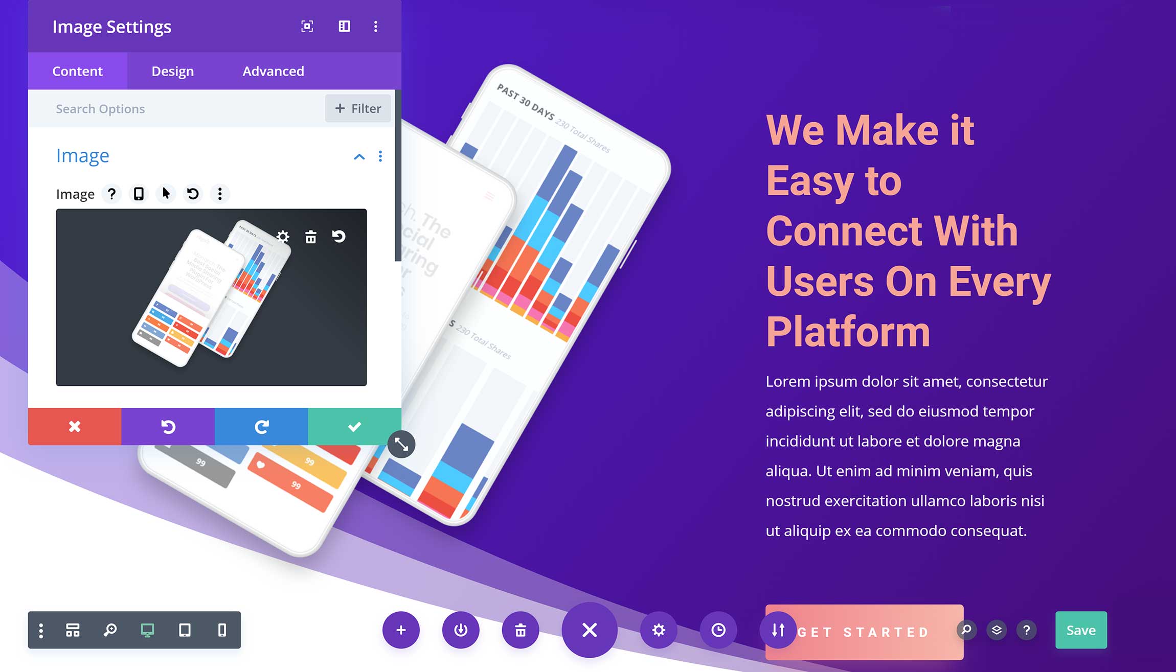
Page builders allow you to insert a wide variety of content into posts, pages and other WordPress post types: you simply select the content you want and drag and drop it into your layout.
The default WordPress editor calls them content blocks, Divi calls them modules and Elementor calls them widgets.
They are, of course, the same thing.
While the default WordPress editor allows you to adjust three or four settings for each block, in Divi and Elementor there are dozens of unique settings.
This gives you complete control over what’s displayed and how it’s styled.
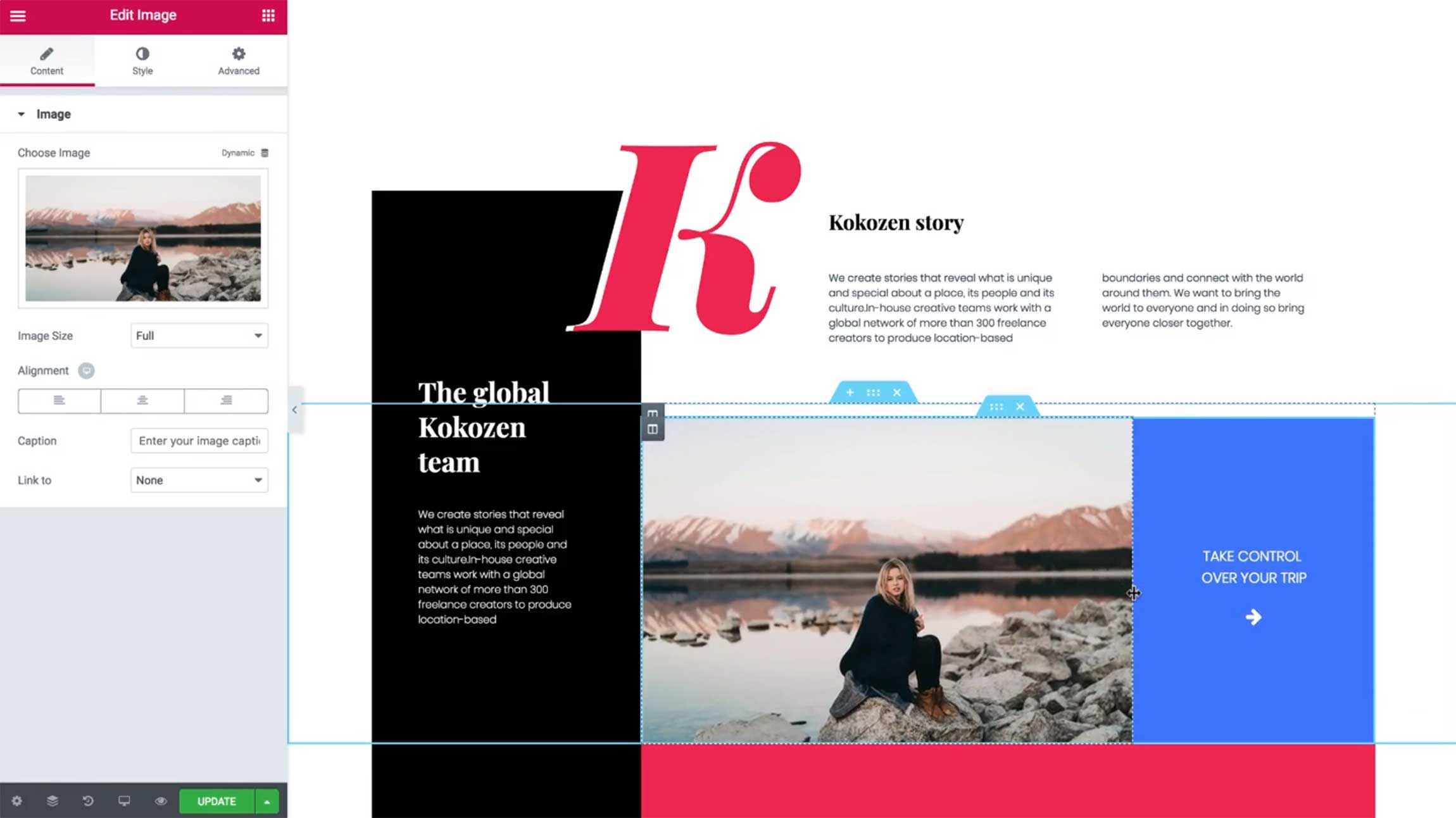
Hundreds of pre-made template designs are available in Divi and Elementor.
These pre-made layouts can save you a huge amount of time when creating pages, as all you have to do is select a design and apply it to your page.
Theme builders are available in both plugins too, which can be used to change website headers, footers, sidebars and more.

Throughout this article, you’ll see that Divi and Elementor tackle website creation and page building in different ways; however, they do also share many similarities.
Both of these WordPress plugins:
- work with any WordPress theme
- feature user-friendly interfaces
- offer responsive designs that look great on any device
- are designed for beginners, but also offer advanced features for developers
- have great support for third-party plugins, such as WooCommerce.
Both Divi and Elementor also have large communities, which has helped to grow a market for third-party products and customizations that expand the functionality of the plugins even further.
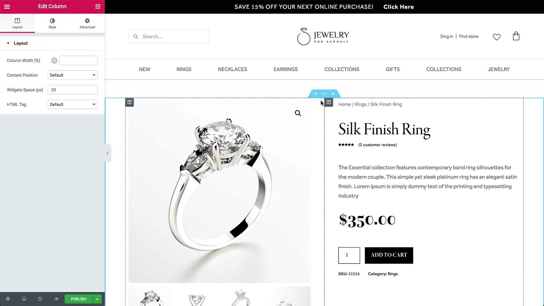
While Divi has always been a premium WordPress product, the core version of Elementor is available free of charge.
Today, Elementor is active on more than 5 million WordPress websites, which is no surprise given how generous the developers have been with the features available in the free version of their plugin.
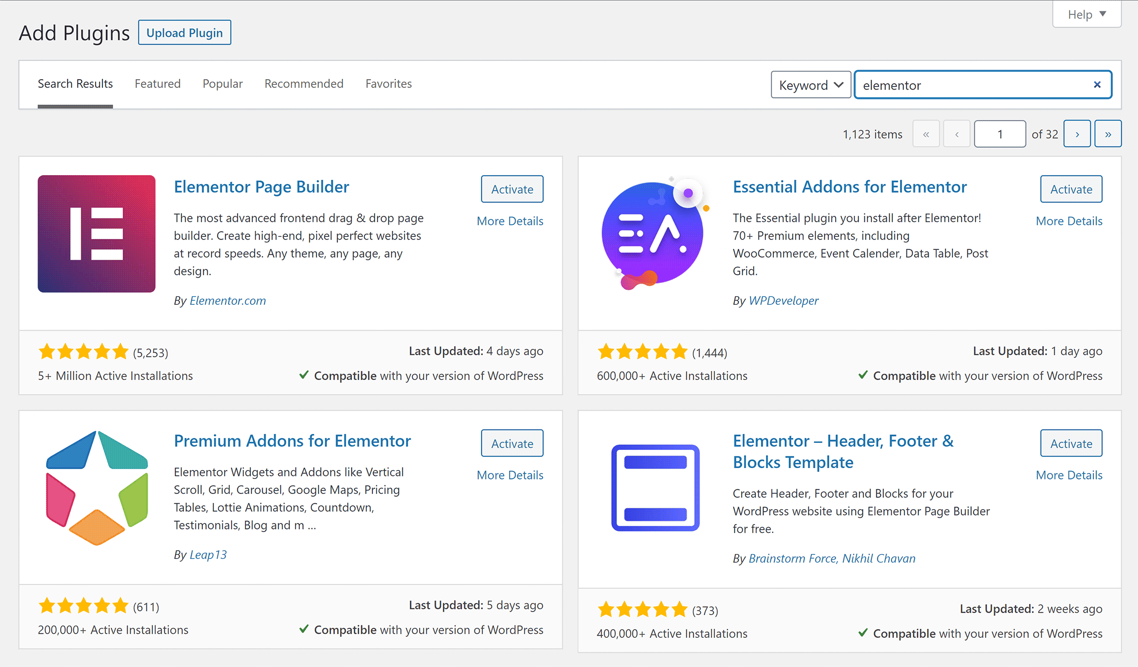
The key thing to understand about Divi and Elementor is that both page builders expand WordPress functionality considerably by:
- giving you full control over how your website looks
- saving you time creating complex layouts
- simplifying the process of making website customizations.
The plugins simply tackle page building in slightly different ways.
The Confusing Branding of Divi
Before we compare Divi and Elementor, I need to clear up the confusing branding Elegant Themes has used for Divi.
Divi was launched as a WordPress theme in 2013, and it quickly established itself as the most popular ‘All-In-One’ WordPress theme on the market.
Two years later, standalone WordPress plugin Divi Builder was released, so Divi’s page building functionality could be used with any WordPress theme.
It was around this time that Elegant Themes started calling the WordPress theme ‘Divi Theme’ to distinguish it from the standalone WordPress plugin.
Elegant Themes continues to use ‘Divi’ to refer to the theme, the plugin and both the theme and plugin together.
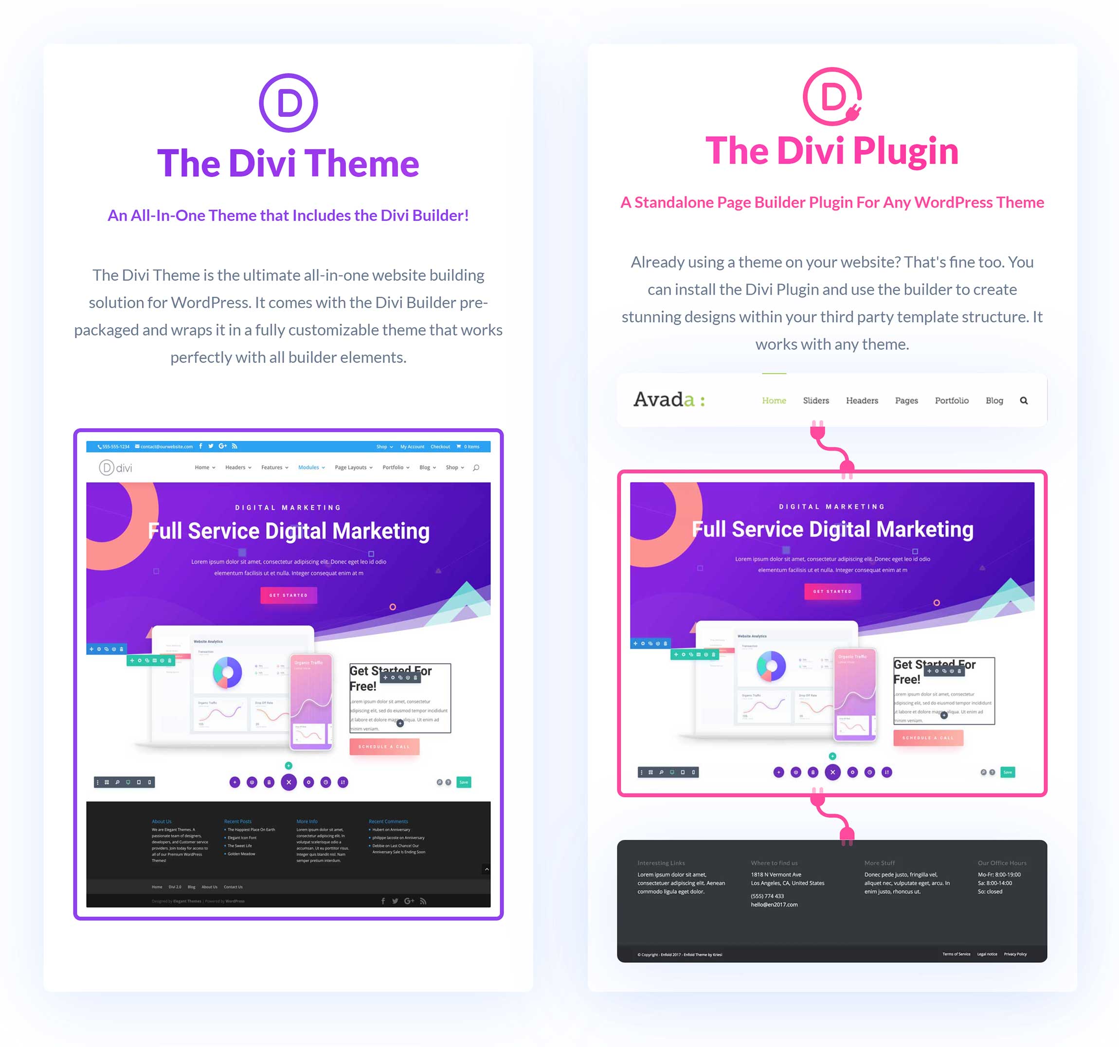
Today, most functionality is built into Divi Builder, and Divi Theme acts as a canvas for the page builder.
Divi Builder is built directly into Divi Theme, but if the standalone Divi Builder plugin is activated Divi Theme will automatically deactivate it when it’s selected as your WordPress theme.
Let’s take a closer look at what these page builders can do.
The Editing Experience
A page builder’s user-interface can be the difference between whether layouts are easy to create or not.
Thankfully, both Divi and Elementor offer a great editing experience.
The main page builder in Divi Builder is a front-end editor that lets you change designs on your live website. However, Divi Builder was originally launched with a back-end page builder.
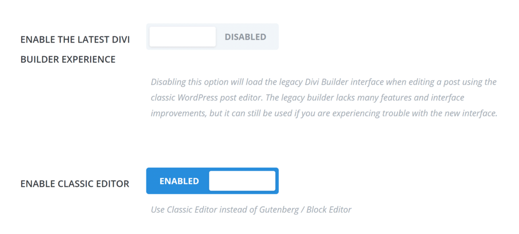
This older style of page editing is still available in Divi, but you need to activate the ‘Legacy Builder’ from the plugin options page by deselecting ‘Enable the Latest Divi Builder Experience’.
Annoyingly, the WordPress classic editor has to be activated throughout your website for it to work too, which means it can’t be used in conjunction with the WordPress block editor.
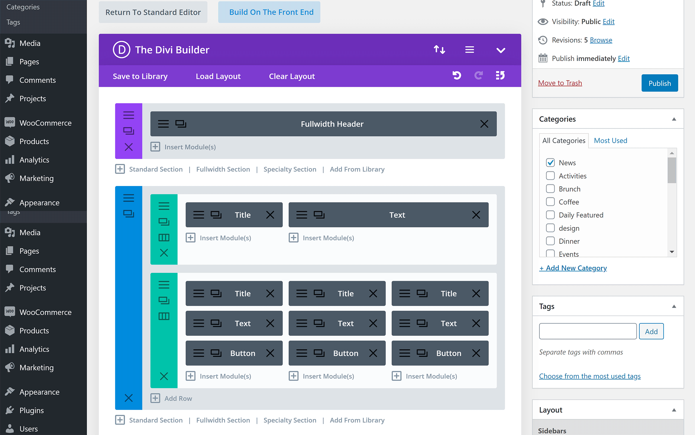
The Legacy Builder allows you to create layouts via a simple drag-and-drop interface.
Its colourful interface is quick to use and gives you access to essential features, such as Divi layouts and your edit history.
Since no design elements are displayed, you can view the whole structure of your page and move things around easily.
Unfortunately, the Legacy Builder does lack many of the features that are available in the front-end editor, and, since modules are represented by simple blocks, you need to continually flip between the back end of your website and the front end to see what your layout looks like.
Elegant Themes calls the front-end editor ‘Visual Builder’.
It has a colorful user-friendly interface and a three-section horizontal menu bar that can be displayed at the top or bottom of your pages.
If you wish, this main menu can be hidden, so you see your whole layout.
The centre of the menu is where you load layouts, save layouts, clear your layout, and export and import layouts. You can also modify important page settings from here, and view an editing history box that allows you to undo and redo changes.
Layouts can be saved on the right-hand side of the main menu. From this area, you can also search through Divi features, access all layout layers (sections) and access a help box.
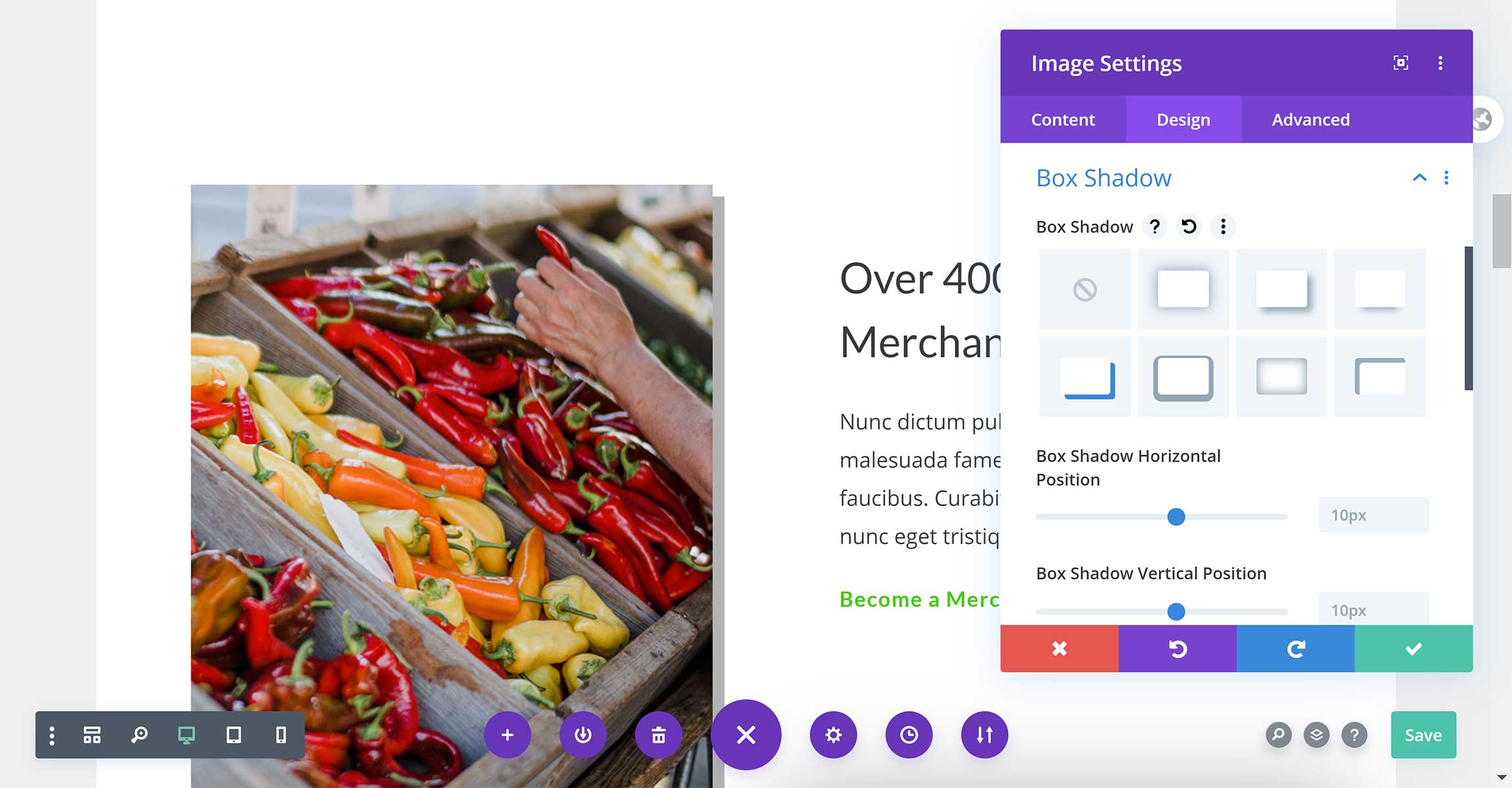
On the left-hand side of the menu, you can adjust default builder settings, zoom in and out of your layout, and view your layout in desktop, tablet and mobile views.
By far my favourite feature here is Wireframe View mode.
This feature strips away all of the visual elements of your page to let you view all sections, rows, columns and modules. I activate this feature when I want to change the structure of my layout.
As you can see, Wireframe View mode looks like the back end Legacy Builder editor. It works in the same way too, making the old editor feel a little redundant.
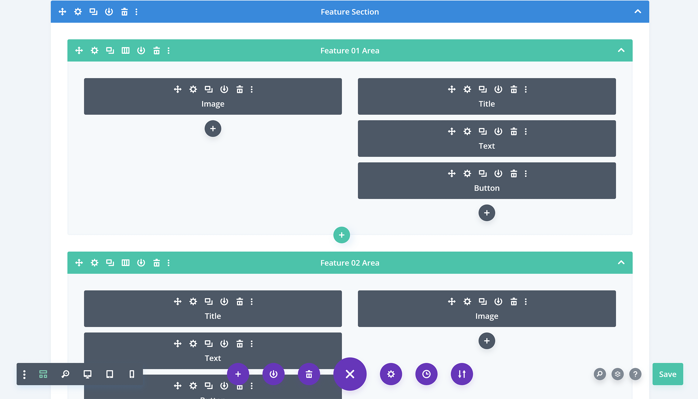
There are a ton of options in Divi, but Elegant Themes has ensured the interface is easy to use, which makes styling content and moving things around simple.
When you hover over sections, rows, columns or modules, you’ll see an options bar that allows you to move it, duplicate it, save it to library, delete it, access settings and more.
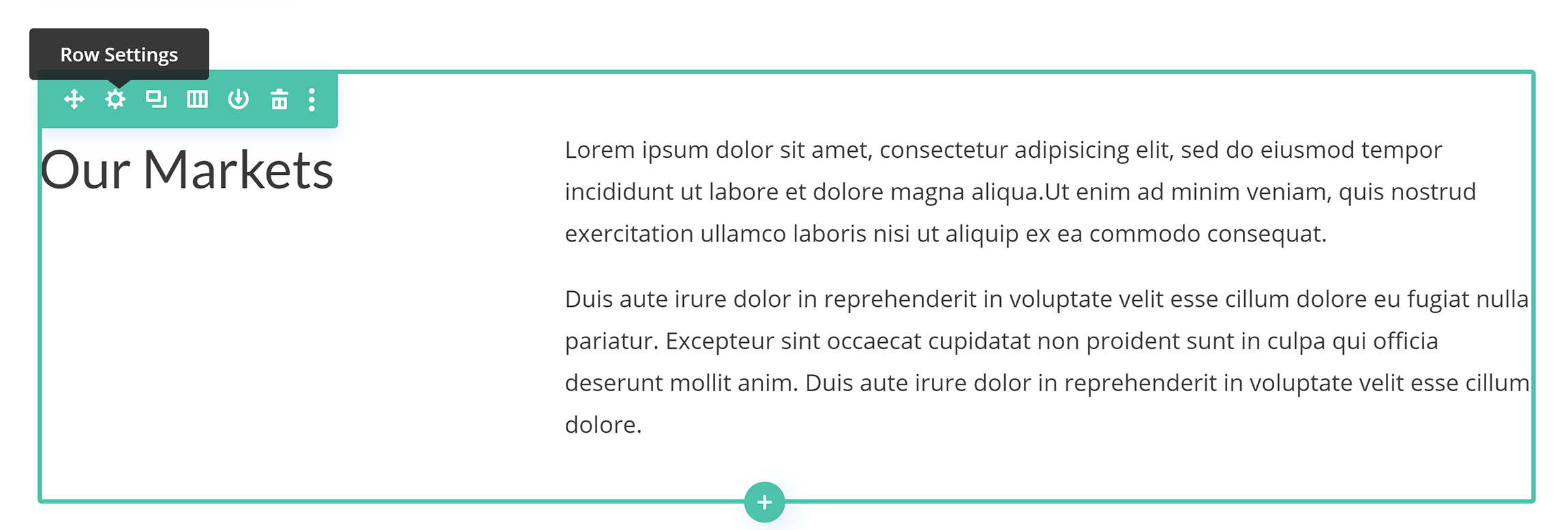
Text can be edited directly on the page, all you have to do is click on text to change its formatting or styling.
Dedicated settings boxes are used for modifying other types of content and settings.
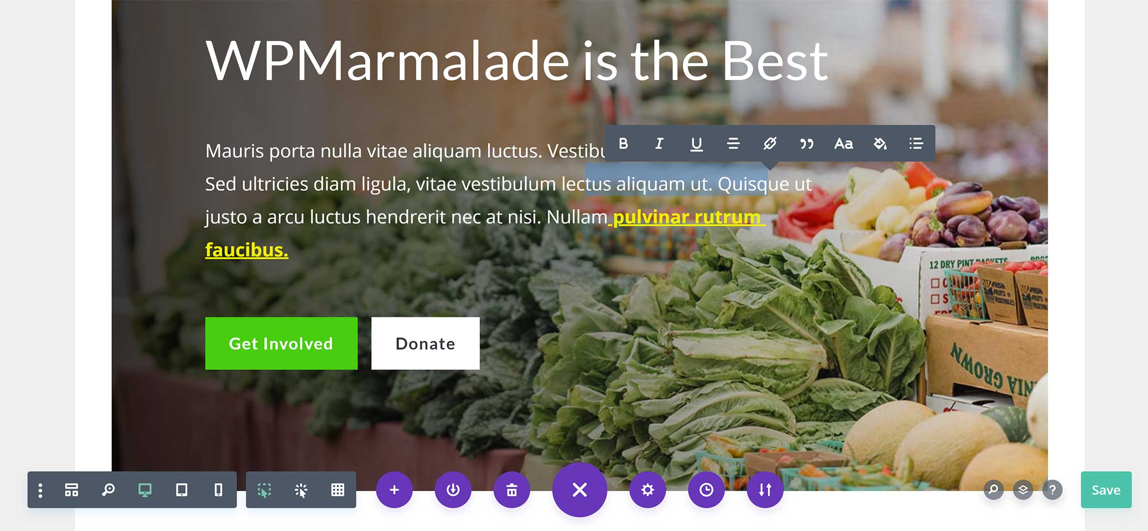
Divi layouts can also be inserted into layouts you’ve created with the WordPress block editor.
This is a feature that’s, unfortunately, missing from Elementor at this time, which is a shame, as I like the option of using the WordPress block editor as my default editor, and then simply importing advanced layouts into content when required.
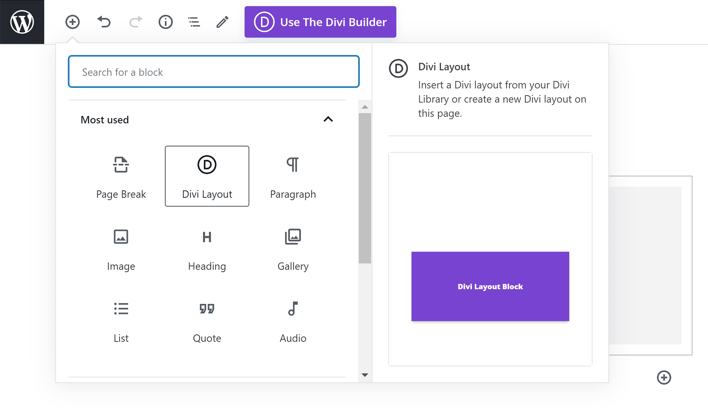
Elementor launched in 2016 as a standalone WordPress plugin.
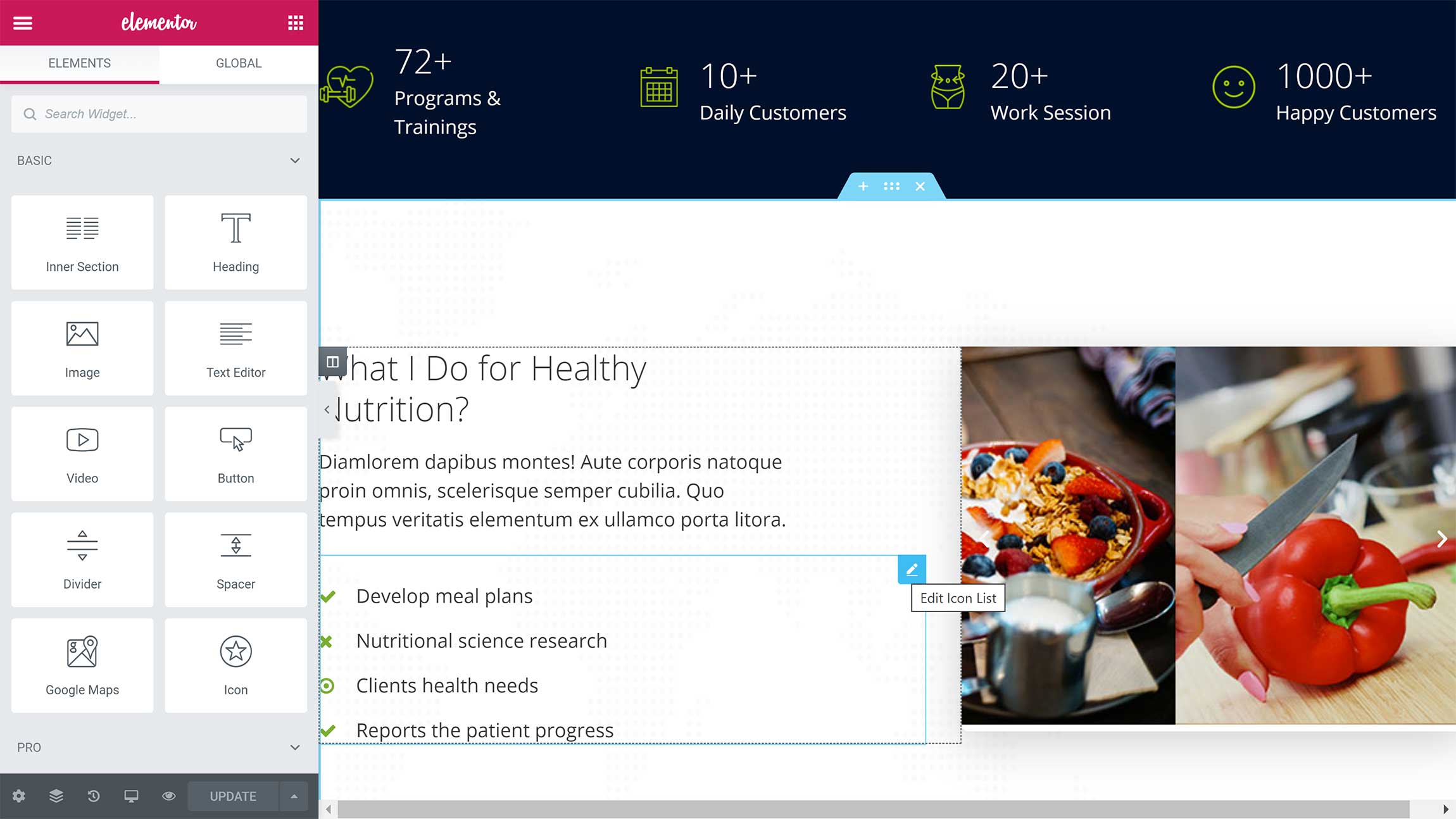
It’s a fast-loading front-end editor that displays all options in a panel on the left-hand side of the page.
This panel can be displayed on the right-hand panel if you wish, and you can change its size and minimise it to help you to see your full layout. A third-party WordPress plugin that lets you collapse the panel and drag it anywhere you want on the page is also available.
Whereas Divi Builder displays settings in pop-up boxes, Elementor displays all settings in the side panel.
This method provides a cleaner user interface, as the page is less crowded, which ensures you can see your layout at all times.
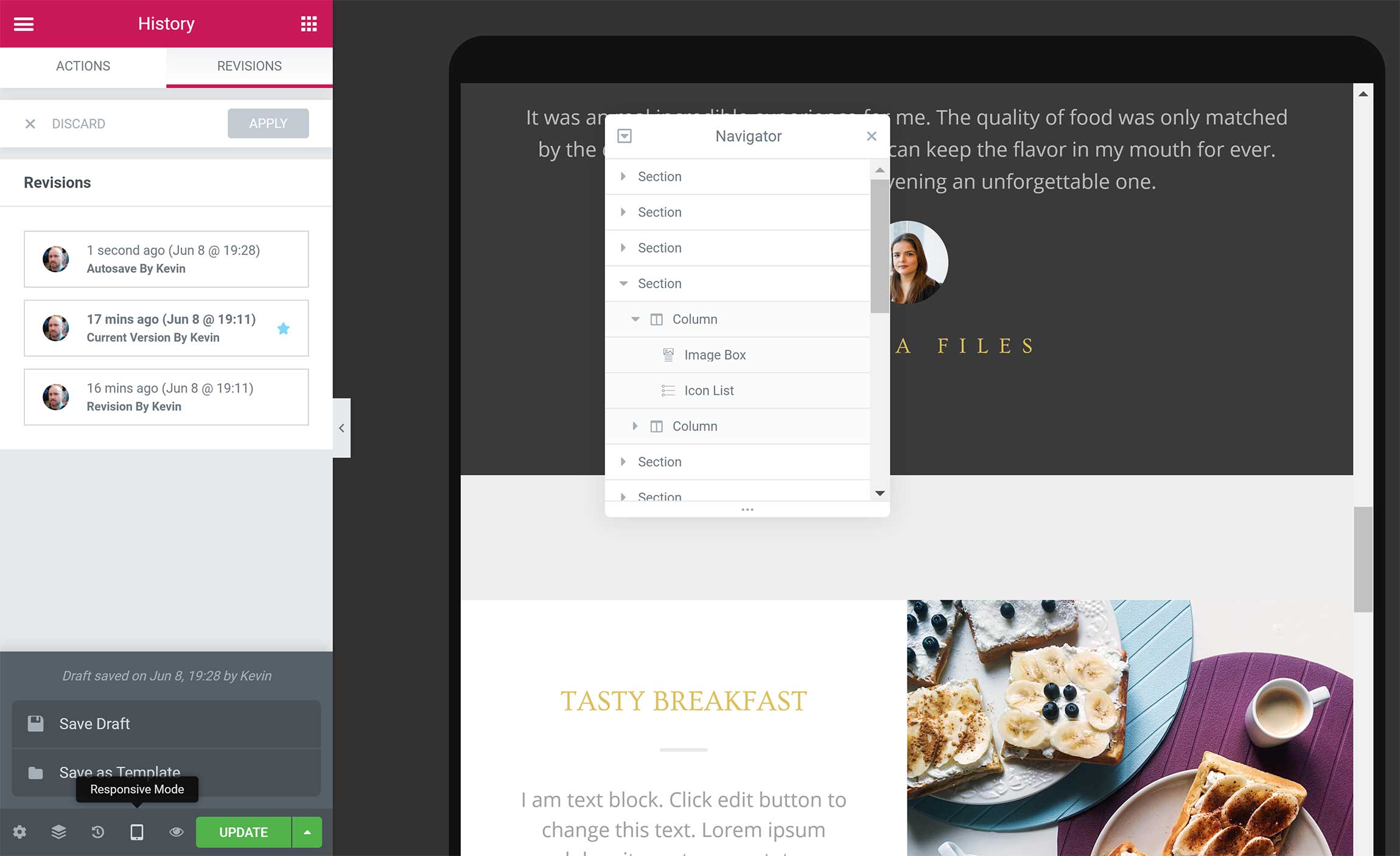
You’ll see many options at the bottom of the panel.
From here, you can load a settings area, load a navigator that shows all sections on your page, and view a history of changes.
Your layout can also be viewed in responsive mode, and you can save your page and save your layout as a template.
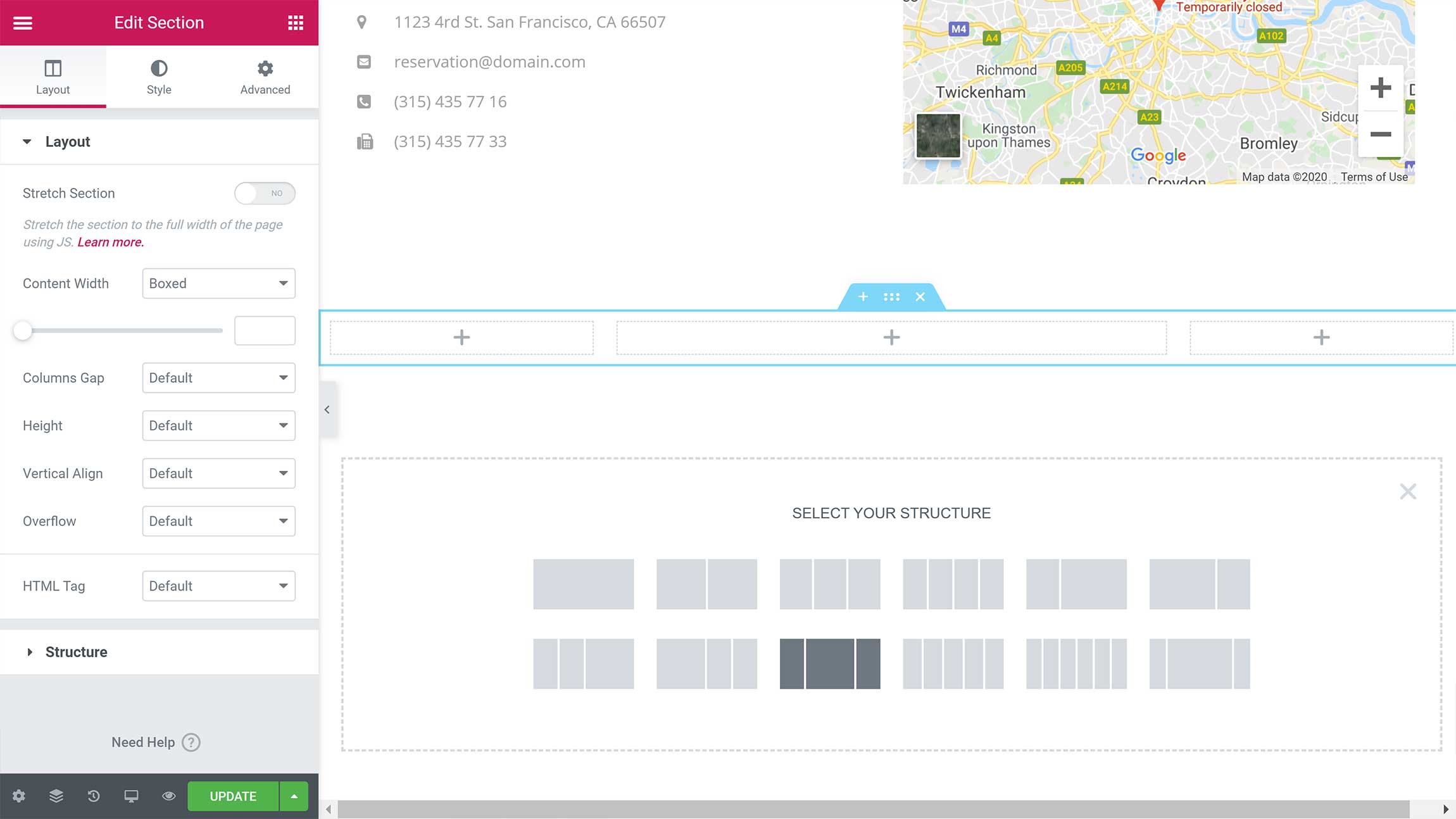
Structuring layouts is easy in Elementor.
You can easily add new sections by clicking on the red plus (+) button at the bottom of your layout. The column structure can then be selected.
Like with Divi Builder, you can edit text directly on the page, and there are options to move and delete sections, rows, columns and widgets.
If you click on the icon with six dots at the top of a section, you’ll load section options in the side panel.
There are dozens of layout and styling options here to help you to define the size, shape, color and spacing of your layouts.
When it comes to creating and editing layouts, there are things I like in both Divi Builder and Elementor.
I prefer the larger buttons and icons Divi Builder uses, because all of the text and icons in Elementor feel too small. I also love the fact that I can insert Divi layouts directly into content using the WordPress block editor.
Wireframe View mode is another standout feature for me in Divi Builder, and, while back-end editors are starting to look dated, I appreciate the fact that their Legacy Builder is still available to those who want it.
In comparison to Divi Builder, editing in Elementor feels a little faster. Editing layouts also feels less crowded, because all settings are displayed in the side panel instead of pop-up boxes in the centre of the page.
It takes a little longer to familiarise yourself with where the settings are in Elementor, but I think the developers have done the right thing by placing all settings in a panel at the side of the page.
Modules & Widgets
Page layouts are created using sections, rows and columns. Content can then be added to your layout using modules.
Divi offers 38 regular modules; if WooCommerce is activated, 16 additional modules are available.
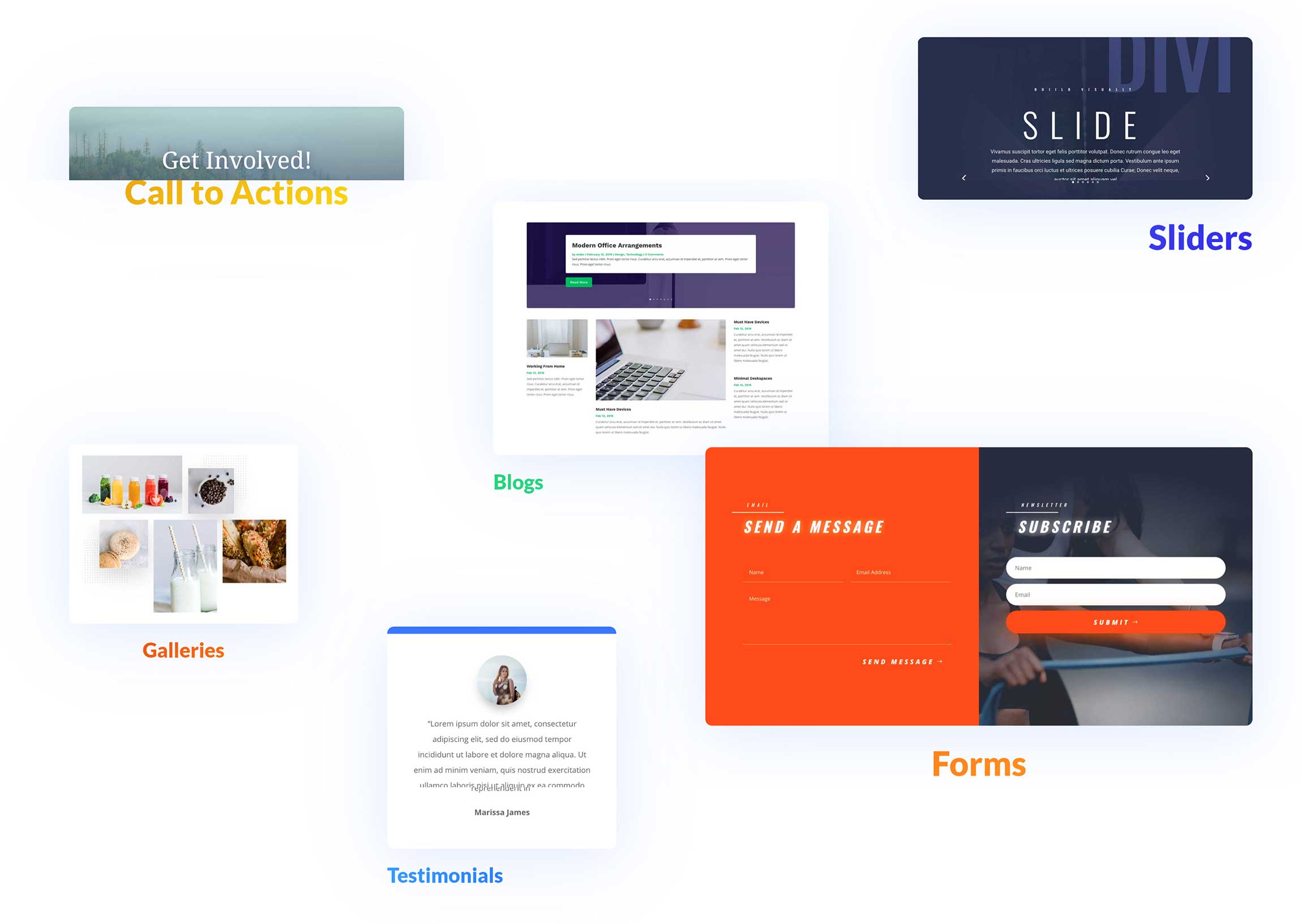
There are modules for posts, images, videos, contact forms, maps, pricing tables, testimonials and more.
Third-party WordPress plugins, such as Supreme Modules and Divi Enhancer, expand functionality further by adding additional modules to Divi Builder.
To add modules to your page, you need to first insert a row and select its column structure.
Once you’ve inserted the row, a box will appear asking you to insert a module.
You can select from the 54 predefined modules or add a customized module from your library.
The sidebar module can be used if you want to add WordPress widgets.
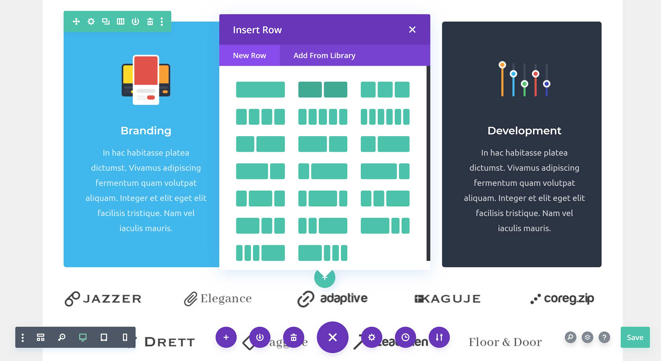
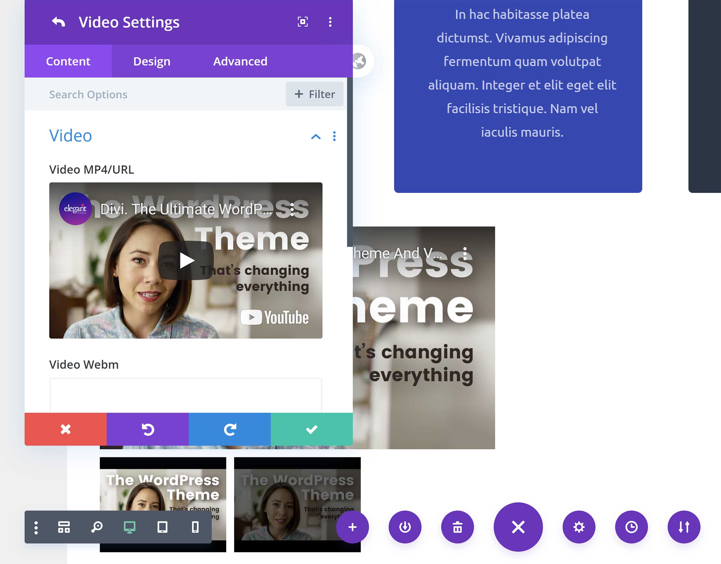
In the module settings box, you’ll see a number of fields for changing what’s displayed, but what’s really impressive is the number of styling options available.
Divi Builder gives you complete control over how each module looks, you can adjust the background, size, spacing, borders, filters, scroll effects and more.
Elementor uses the term widgets instead of modules.
There are more than 90 unique Elementor widgets across six categories.
- Basic — ten widgets
- Pro — 24 widgets
- General — 20 widgets
- Site — nine widgets
- WooCommerce — 20 widgets
- WordPress — 17 widgets
The Pro, Site and WooCommerce widget categories are only available to those who upgrade to the Pro version of Elementor.
This means free users get access to a total of 47 widgets (30 unique widgets and the 17 default WordPress widgets) and Elementor Pro users gain access to a total of 111 widgets (94 of which are unique).
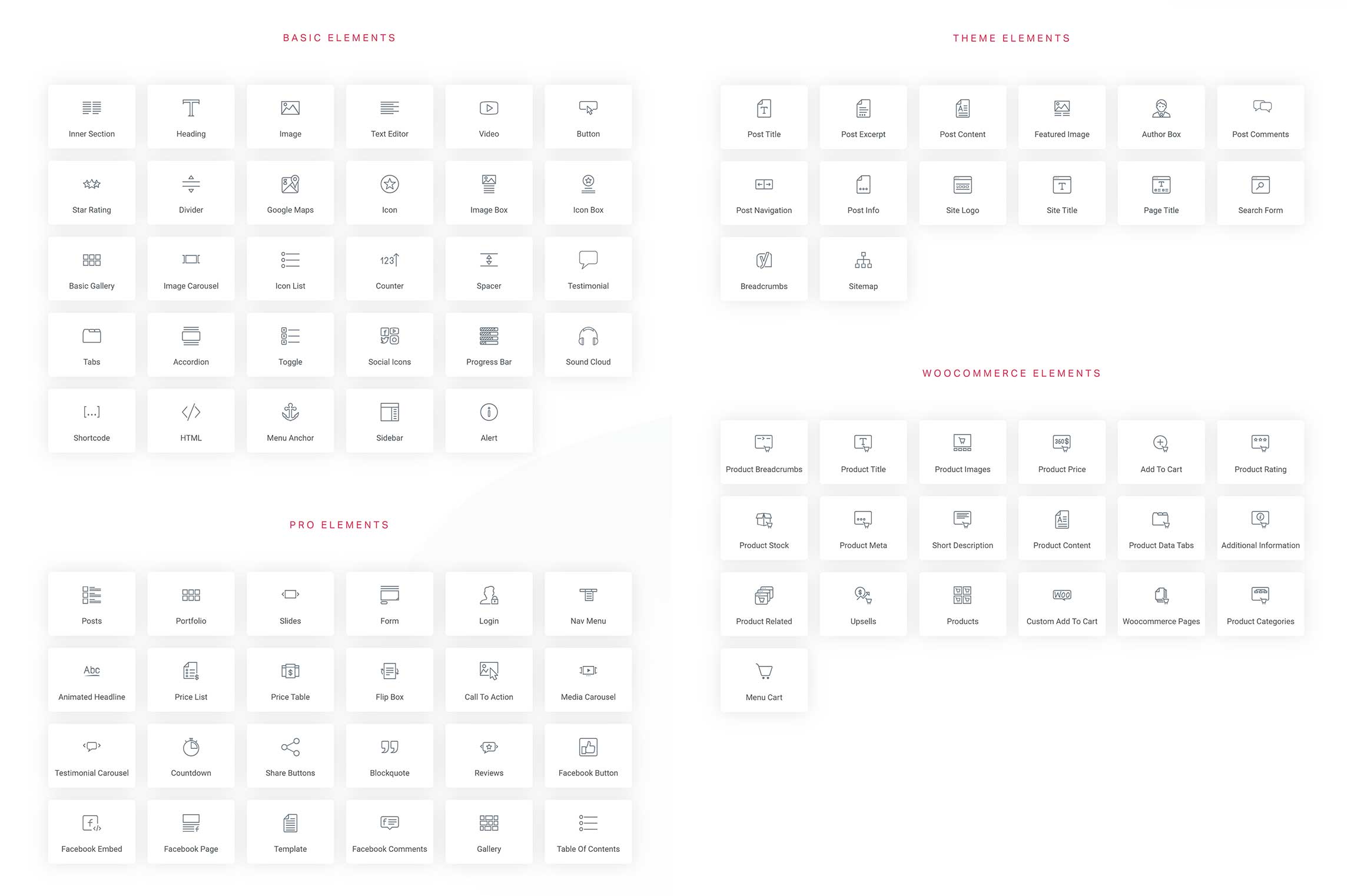
The developers of Elementor have been incredibly generous with the modules that are available to free users. However, you do need to upgrade to Elementor Pro to add widgets for posts, social media and WooCommerce.
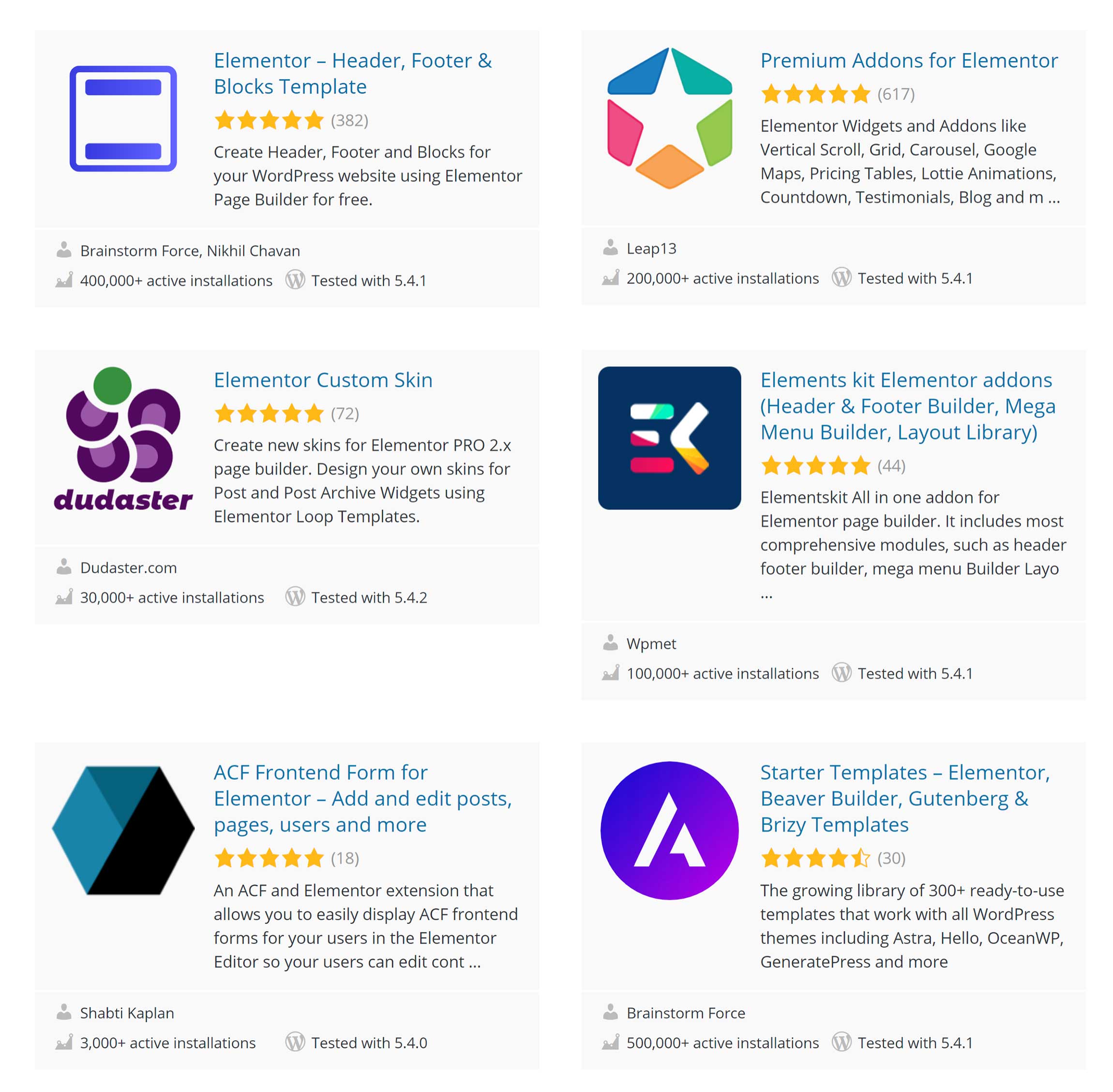
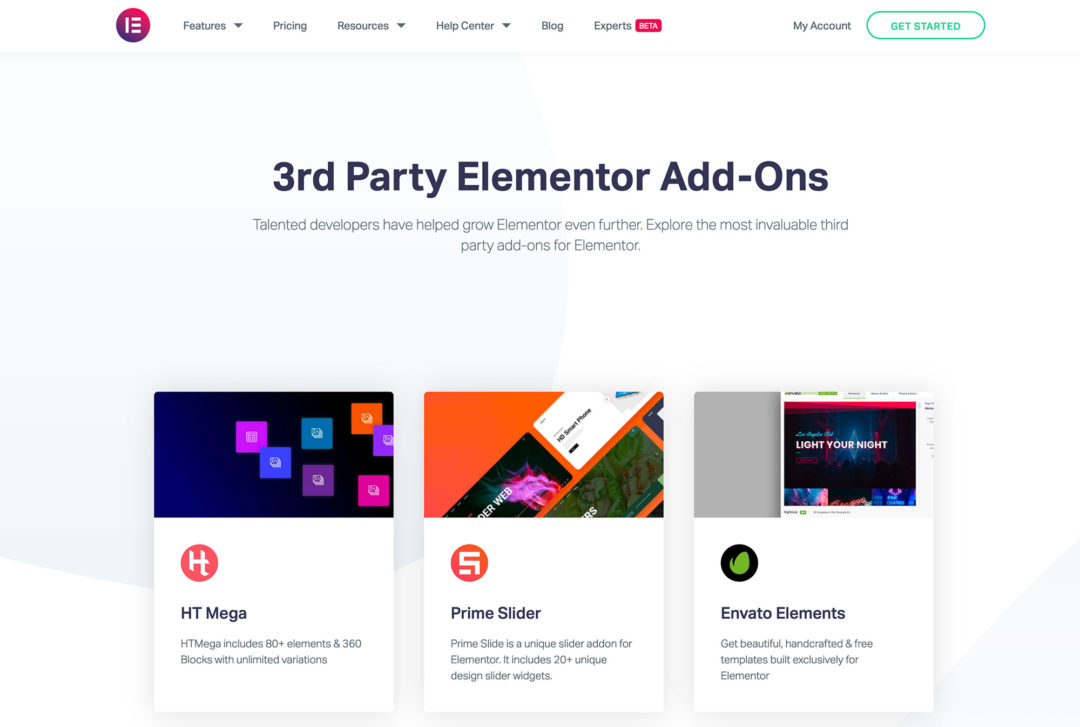
I believe most website owners would benefit from upgrading to Elementor Pro, as it unlocks the full potential of the plugin, but, if you prefer, you can add many more widgets to Elementor via the vast number of Elementor WordPress plugins that are available at WordPress.org.
The process of inserting new widgets into your layout is simpler in Elementor.
In Divi, you need to click on the plus (+) button at the bottom of a row to bring up the module list.
Elementor is more intuitive: You simply select the widget you want from the side panel and drag it to where you want it to be displayed. Widgets can be inserted anywhere, and, if you add one above or below a row, Elementor will automatically create a new row for you and add your widget there.
This method of inserting new widgets is more practical and more efficient.
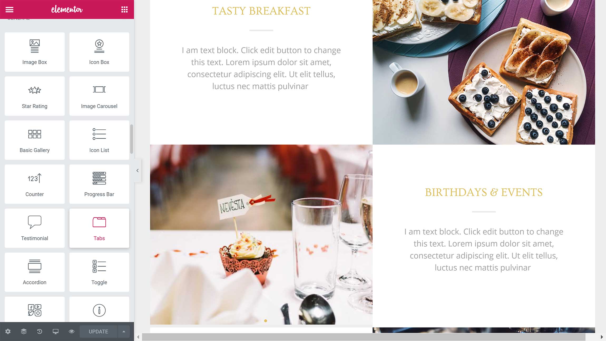
Like Divi Builder, Elementor allows you to customize the content of each widget and change how it’s styled.
There are a few more styling options in Divi Builder, but Elementor is no slouch either: there are options to adjust sizes, padding, margins, positioning, background colors and more.
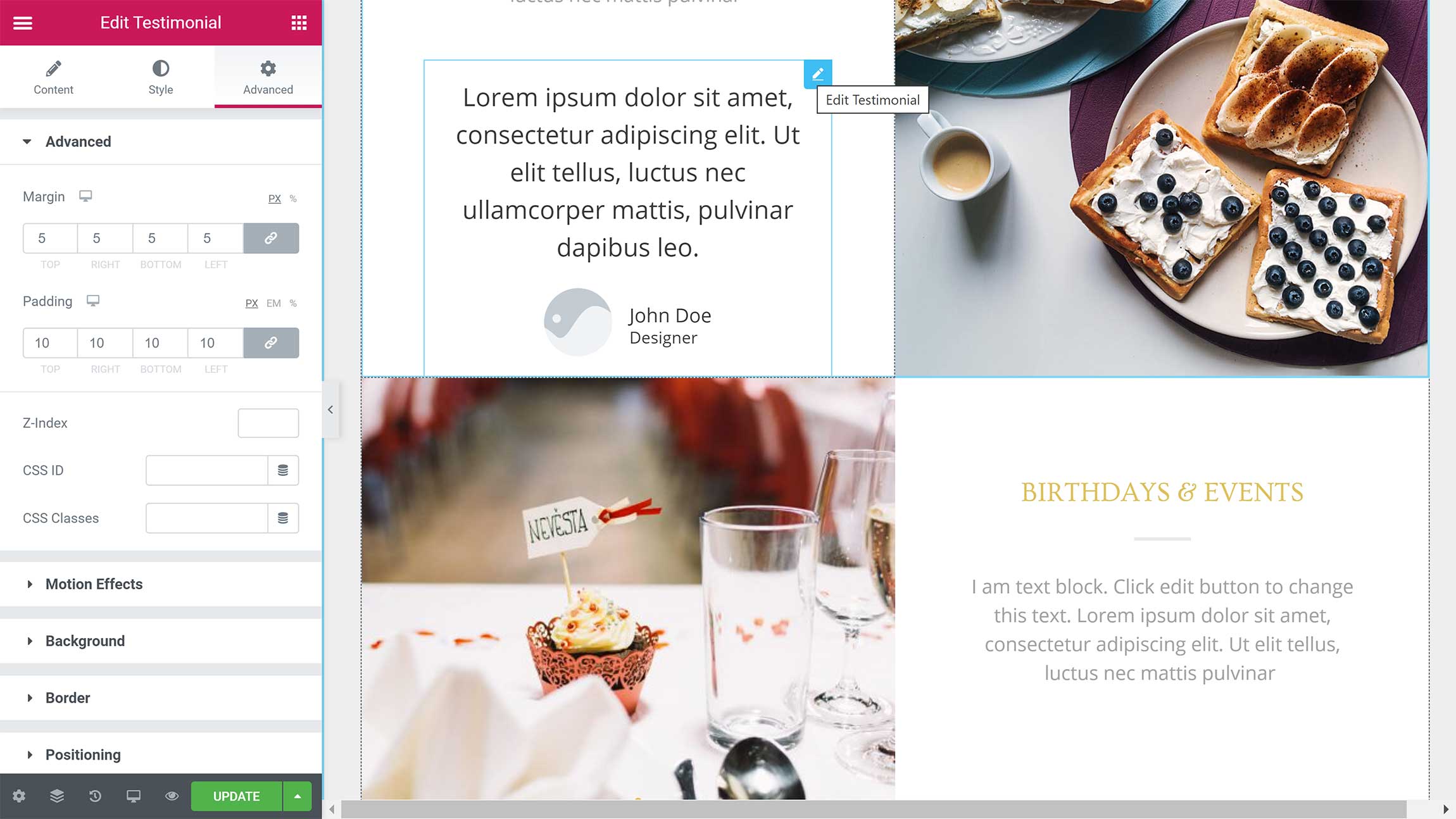
Divi Builder gives you more styling options for modules, and I believe they generally look more professional too.
When it comes to creating unique layouts, though, Elementor is the clear winner.
Elementor includes more content widgets than Divi Builder, and there’s more support from third-party developers too. This allows you to unlock many new widgets and features that aren’t available in Elementor or Elementor Pro.
The overall process of adding new content widgets feels more natural too.
High-Quality Pre-Made Designs
As someone who struggles to create complex designs from scratch, I’m a huge fan of pre-made designs.
Divi Builder and Elementor both come packaged with a large collection of templates.
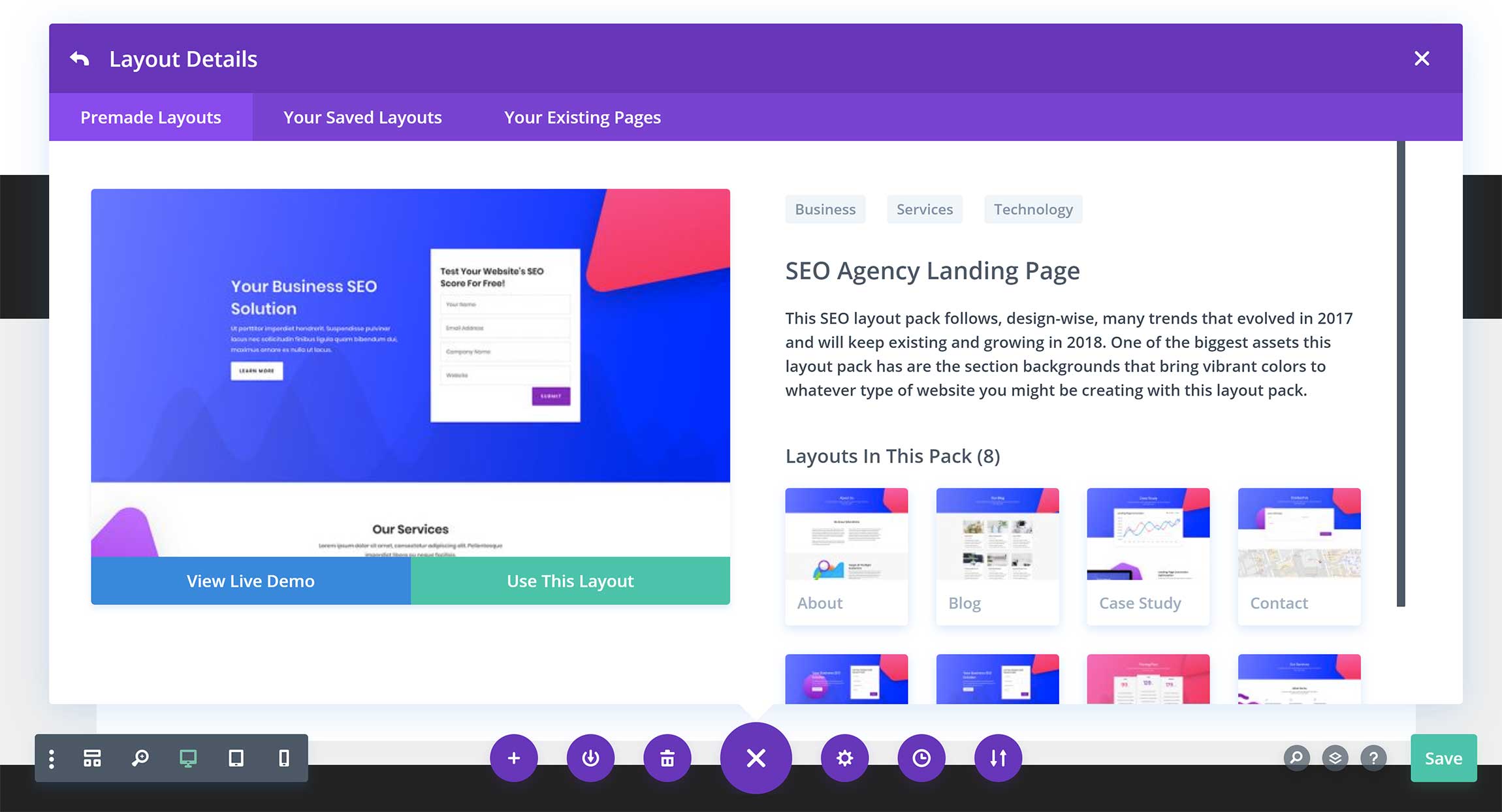
When you launch Divi on a page for the first time, you have the option of starting a layout from scratch, selecting a pre-made layout or cloning an existing page you’ve created using Divi Builder.
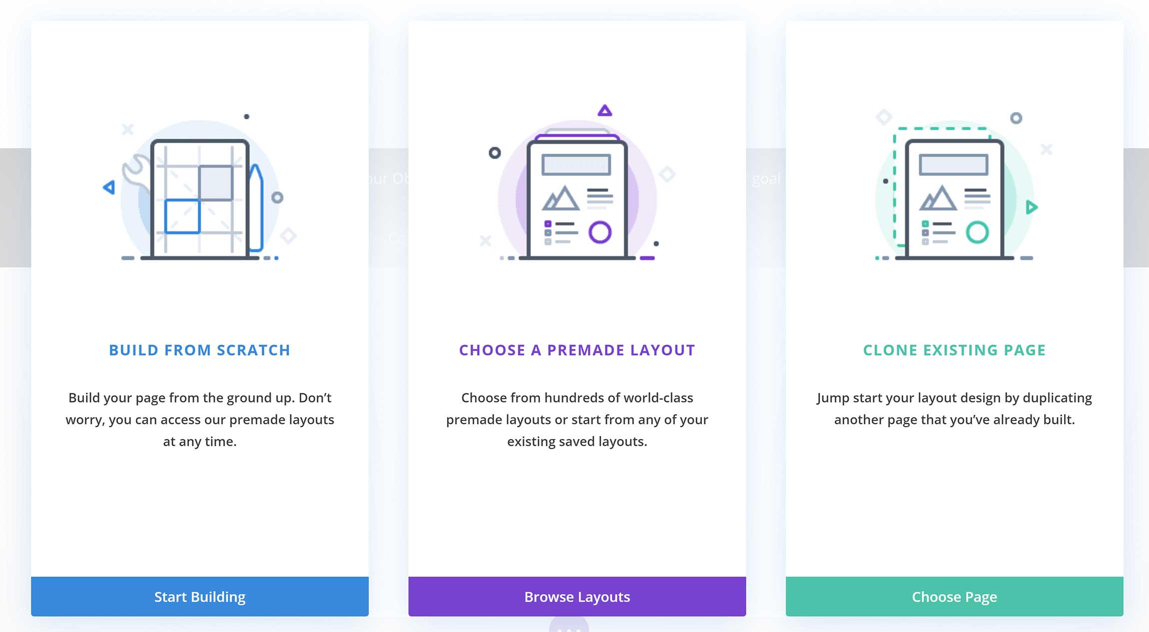
When you select ‘Choose a Premade Layout’, Divi Builder automatically loads up the Divi Library. The library can also be loaded from the main menu.
Thousands of layouts are available in Divi Builder, and you can filter them by category or do a search for a specific design.
Whether you create one from scratch or modify a pre-made design, you can save your layout to the Divi Library and access it again at any time.
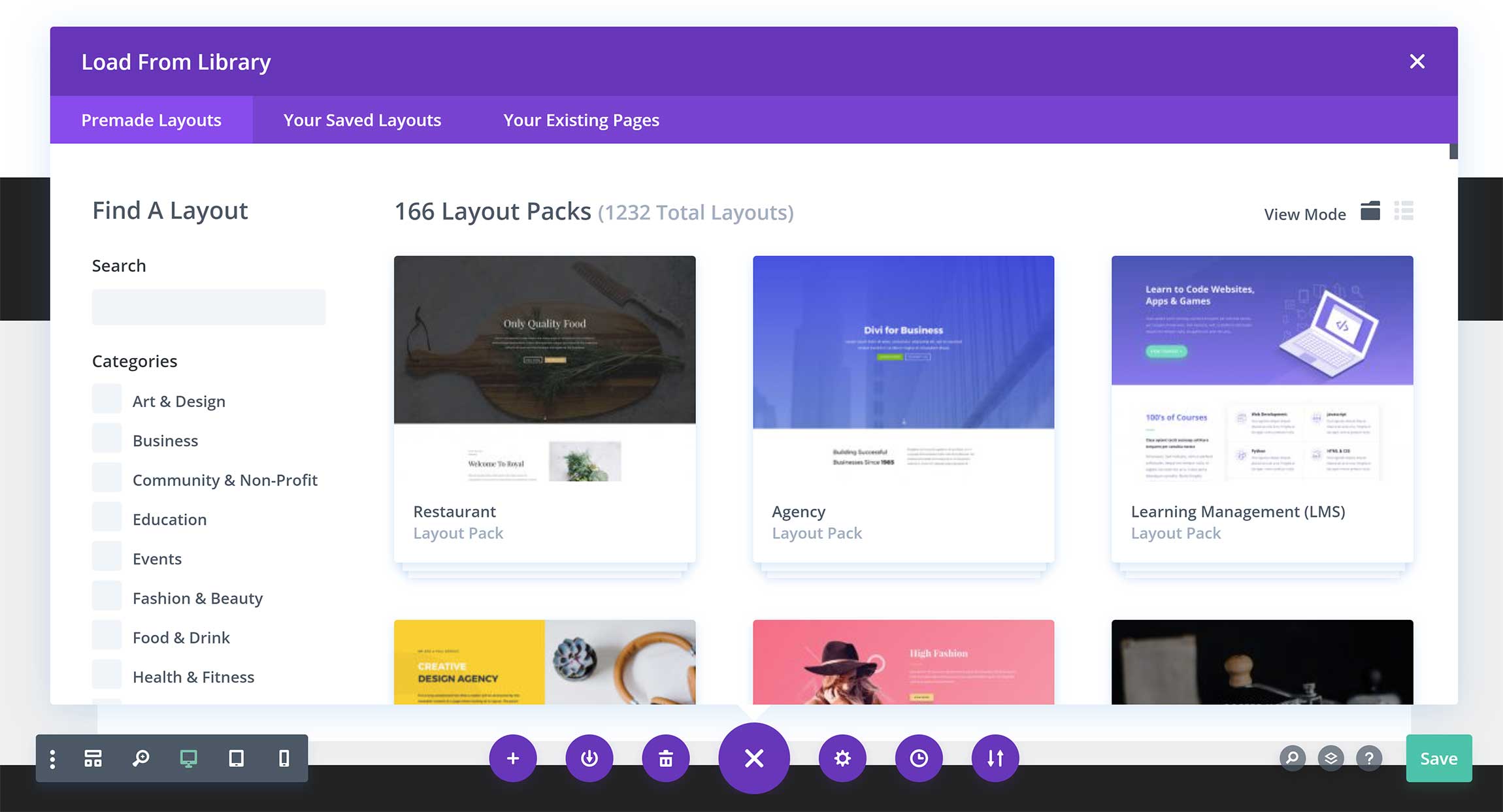
Divi Builder includes more than 160 complete website layout packs.
These packs include layouts for several areas of your website, such as your home page, blog index, about page, contact page, team page and more.
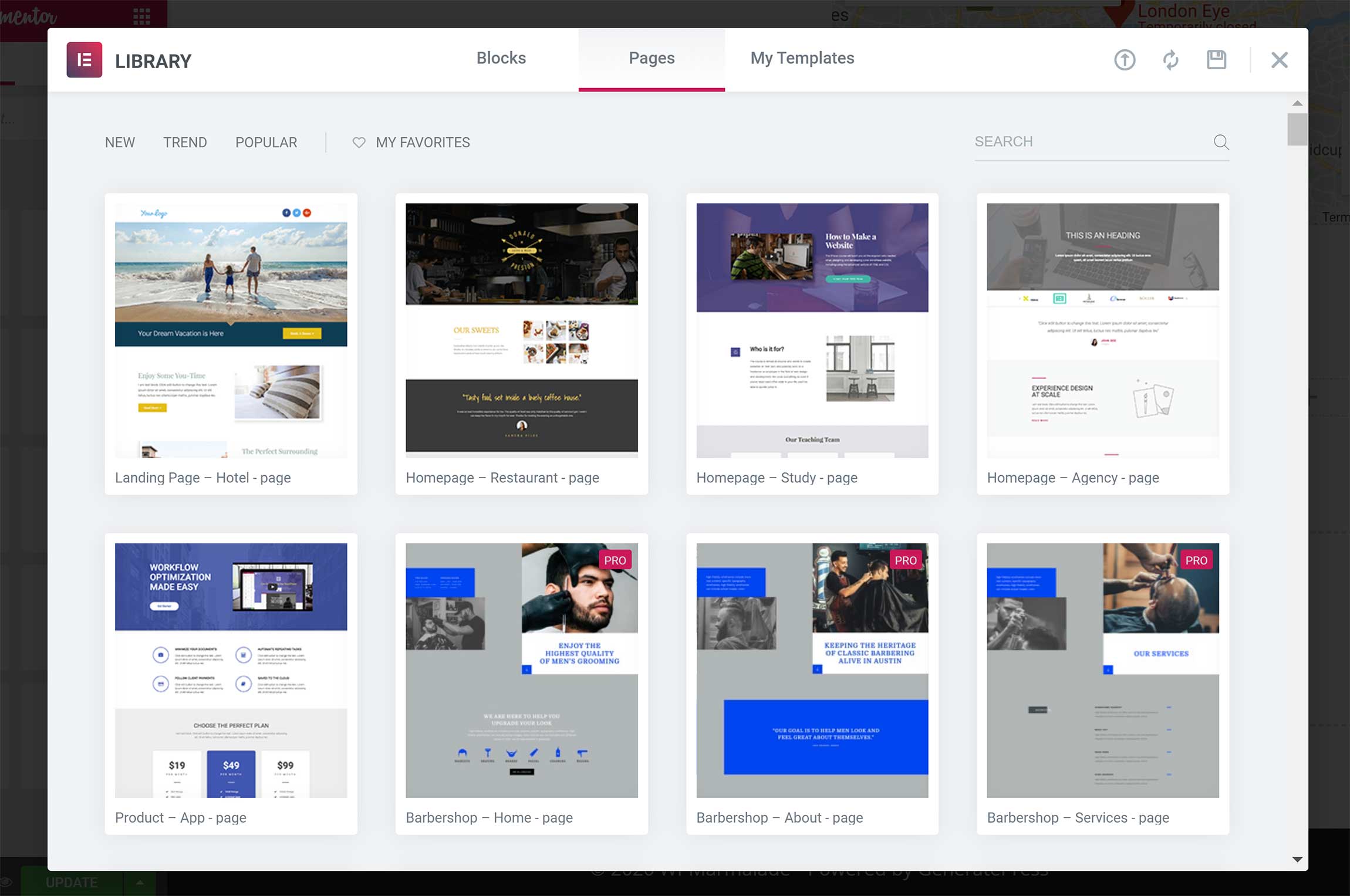
In Elementor, the template library can be loaded from the bottom of the page, and new sections can also be added from this box.
More than a hundred template layouts are available in Elementor free of charge, while 300 more are available if you upgrade to Elementor Pro.
Saved templates can be accessed from this area too, and you can also import layouts using a JSON file or zip file.
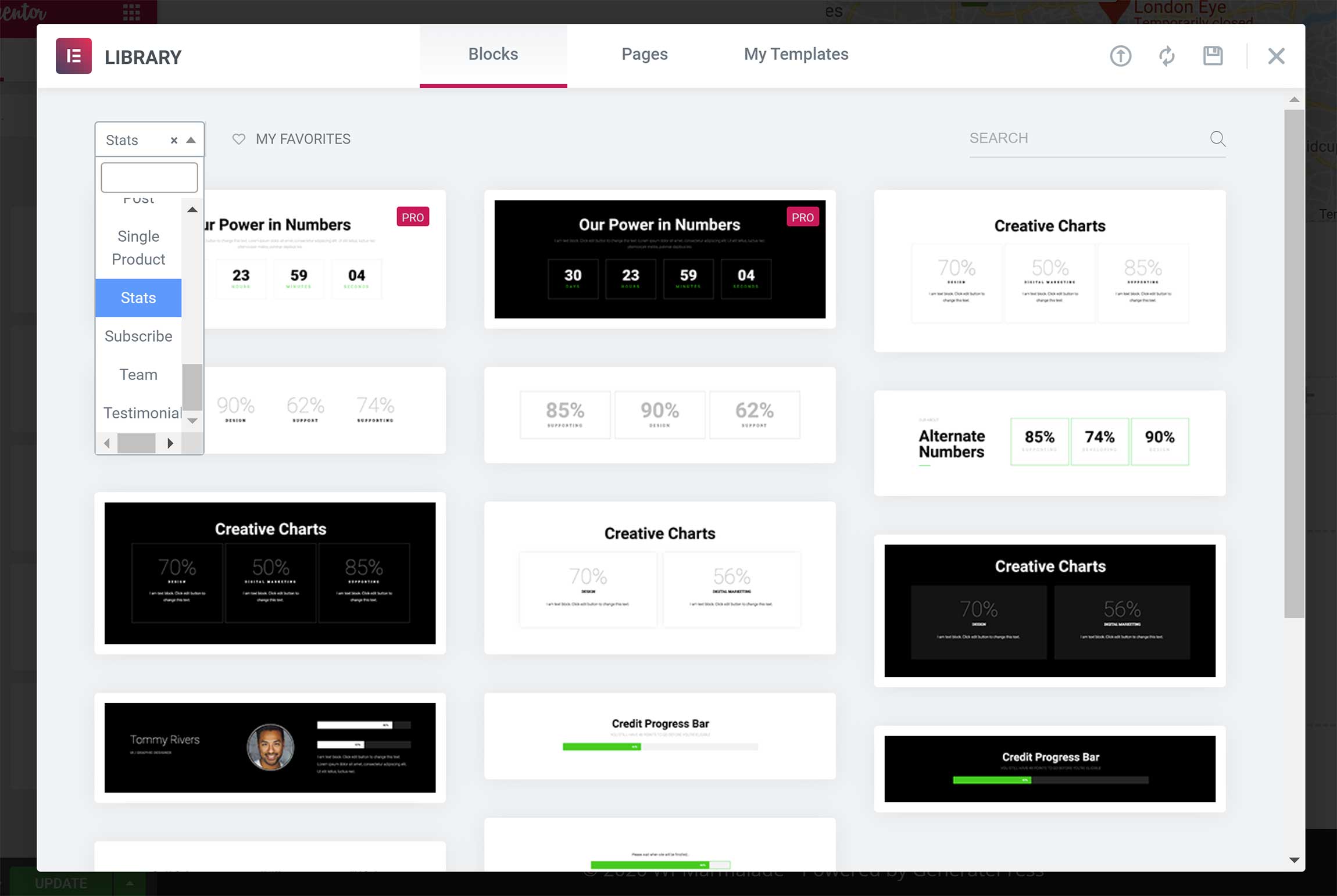
Blocks are a fantastic addition to Elementor.
They’re essentially pre-made sections that are populated with content widgets.
There are more than 300 blocks available across 22 categories, while 50 additional blocks are made available to Elementor Pro users.
The quality of pre-made designs in Divi Builder and Elementor are impressive.
Divi Builder’s layout library is significantly larger, but Elementor’s block library can be used to create unique page layouts from scratch in just a few minutes.
Building a Website with Theme Builders
Page builders are no longer restricted to blog posts and pages: both Divi and Elementor can be used to build unique website designs via theme builders.
In Divi, you can create a template that has a header, body and footer: a layout simply has to be assigned to each section of the page.
You can create as many templates as you wish, and you can specify which pages on your website each template will be applied to.
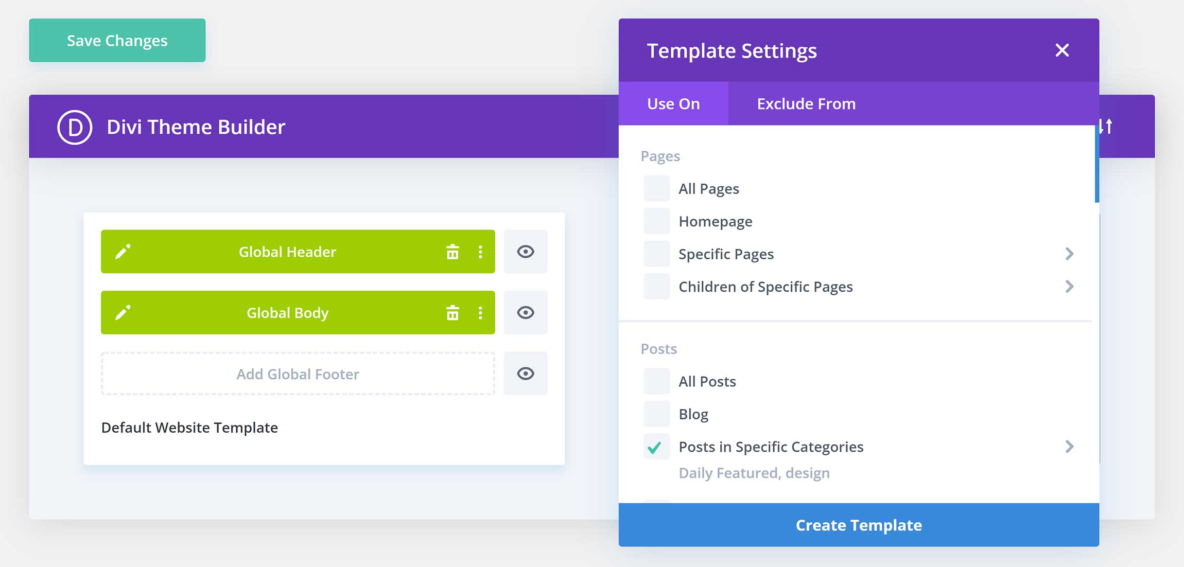
Elementor’s theme builder is available to those who upgrade to the Pro version, and it works a little differently from Divi Builder.
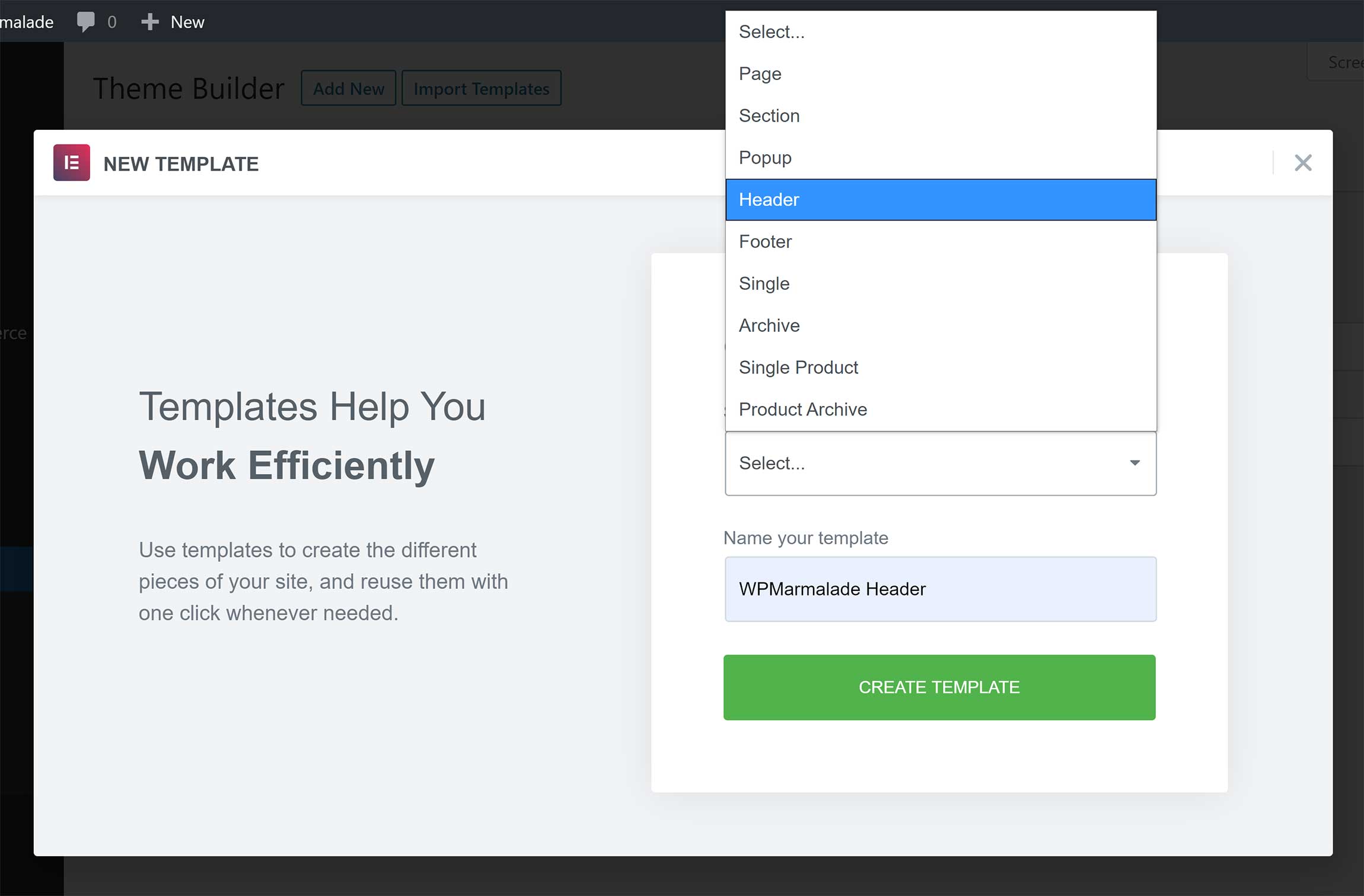
Nine different template types can be created: Page, section, pop-up, header, footer, single page, archive page, single product and product archive.
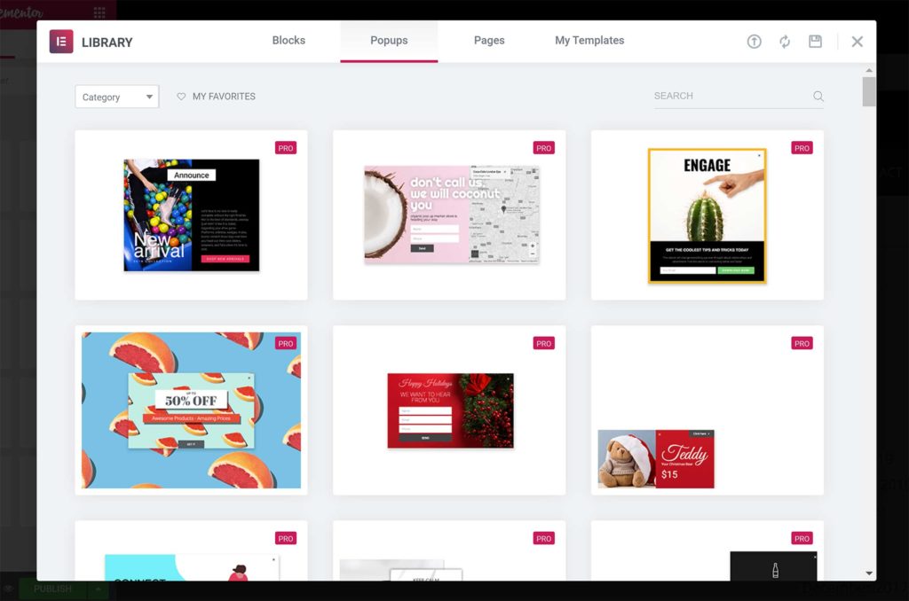
Dozens of pop-up template designs are available through the Elementor theme builder.
Pop-ups aren’t available in Divi Builder directly, but Elegant Themes’ email opt-in plugin, Bloom, can be used to create email marketing pop-up forms.
Once you click to create a template, you’ll be taken to the block library to select a suitable design. Elementor’s page builder will then load so you can modify the template to your liking.
You can then define where you want the layout to be displayed on your website.
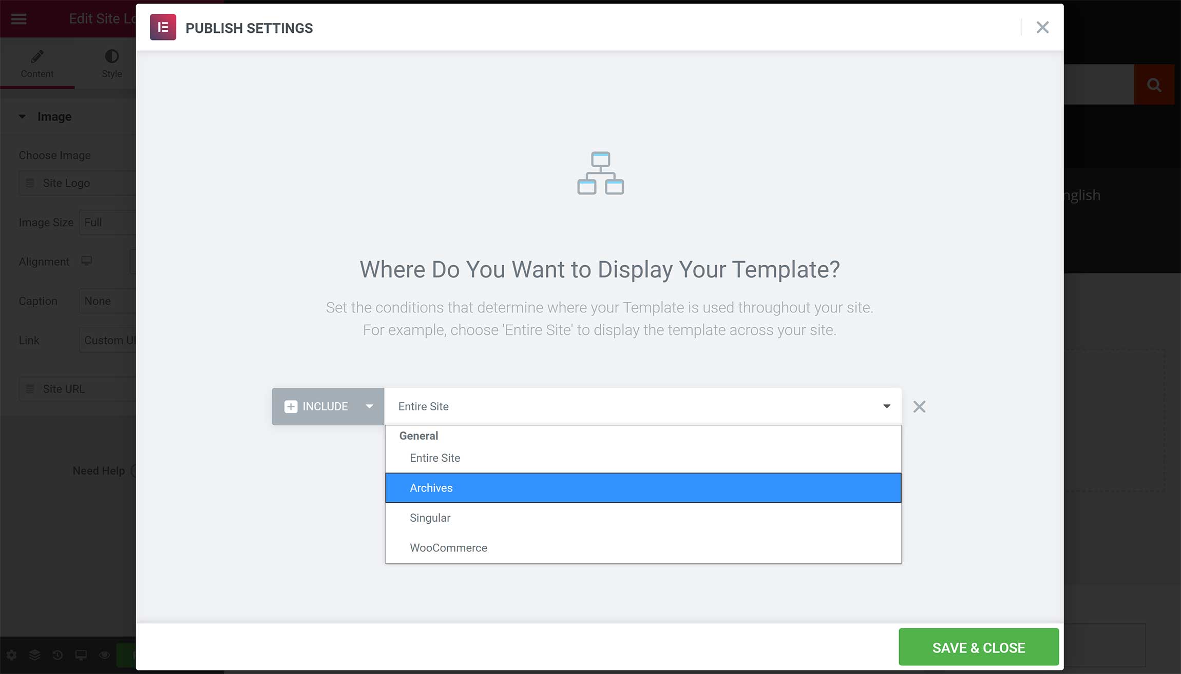
Divi’s theme builder is easier to use and gives you better control over where layouts are displayed on your website, but Elementor’s theme builder is better overall.
It offers more template types and it works perfectly with the Elementor block library.
Divi Theme vs Hello Theme
Minimal WordPress themes allow you to take full advantage of page builders.
They act as a blank canvas for your designs and ensure there are no conflicts between your website’s WordPress theme and the page builder you use.
Despite still being marketed as an ‘All-In-One’ solution, in reality Divi Theme is a basic WordPress theme, as the majority of features and functionality have been transferred to Divi Builder.
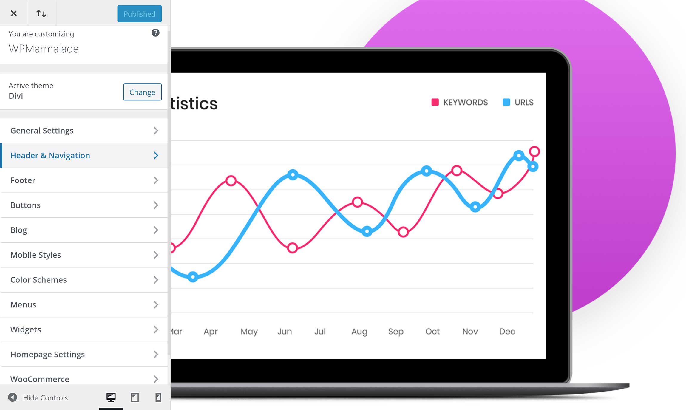
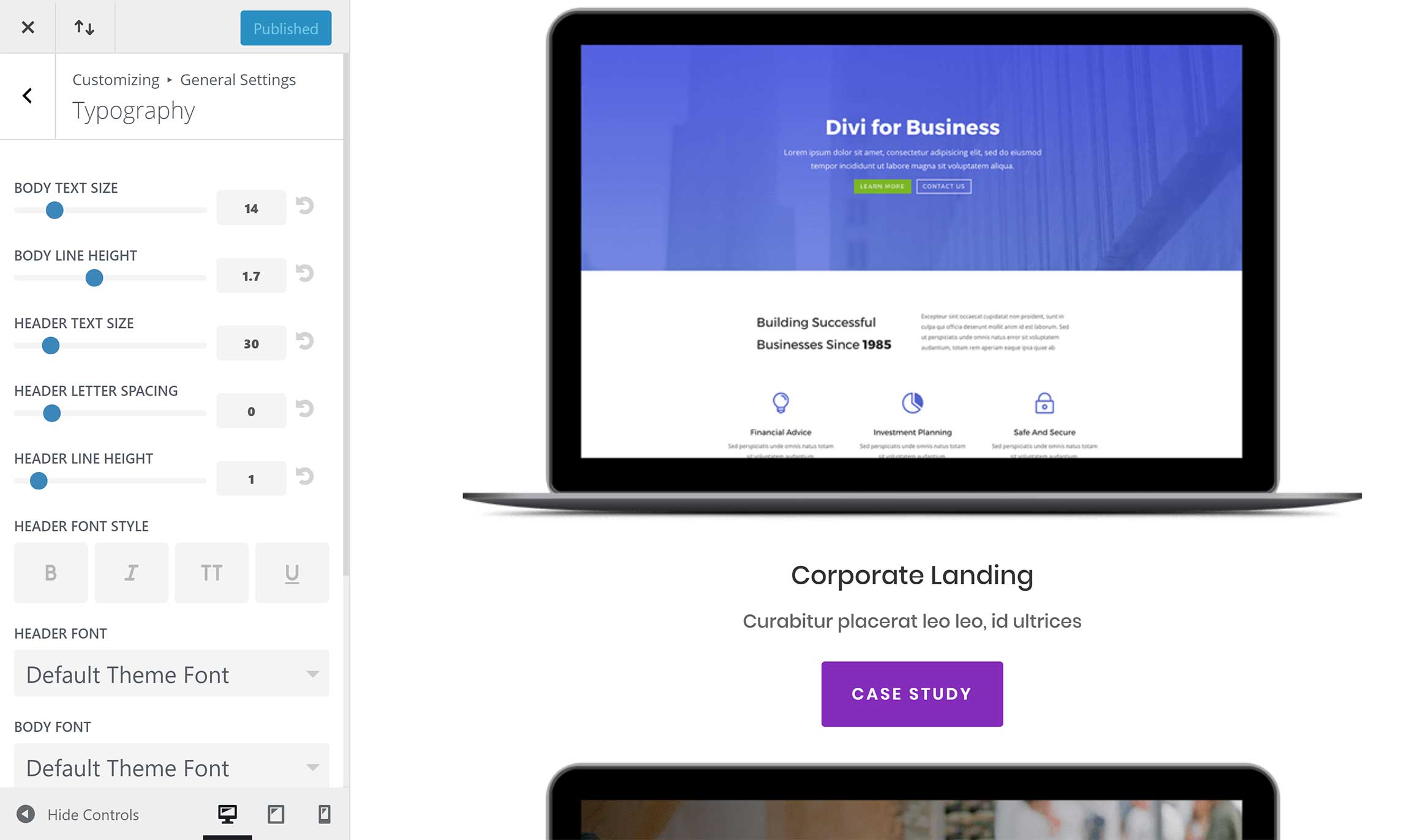
Website designs can be modified in Divi Theme using the WordPress Theme Customizer.
Many useful styling and configuration options can be found across a dozen categories.
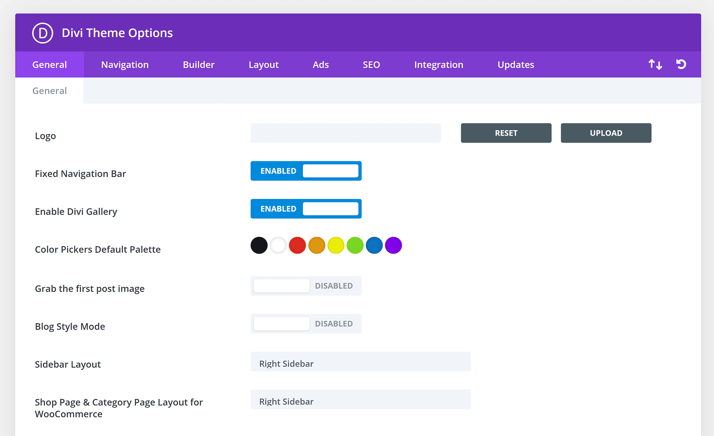
Strangely, Divi Theme places many important styling settings in the main theme options area, including your website logo, default sidebar layout, social media icons and more.
I find it bizarre that theme settings are divided between two different areas.
Take the website logo, for example. It has to be uploaded in the theme options area, but you need to adjust the height of the logo in the WordPress Theme Customizer.
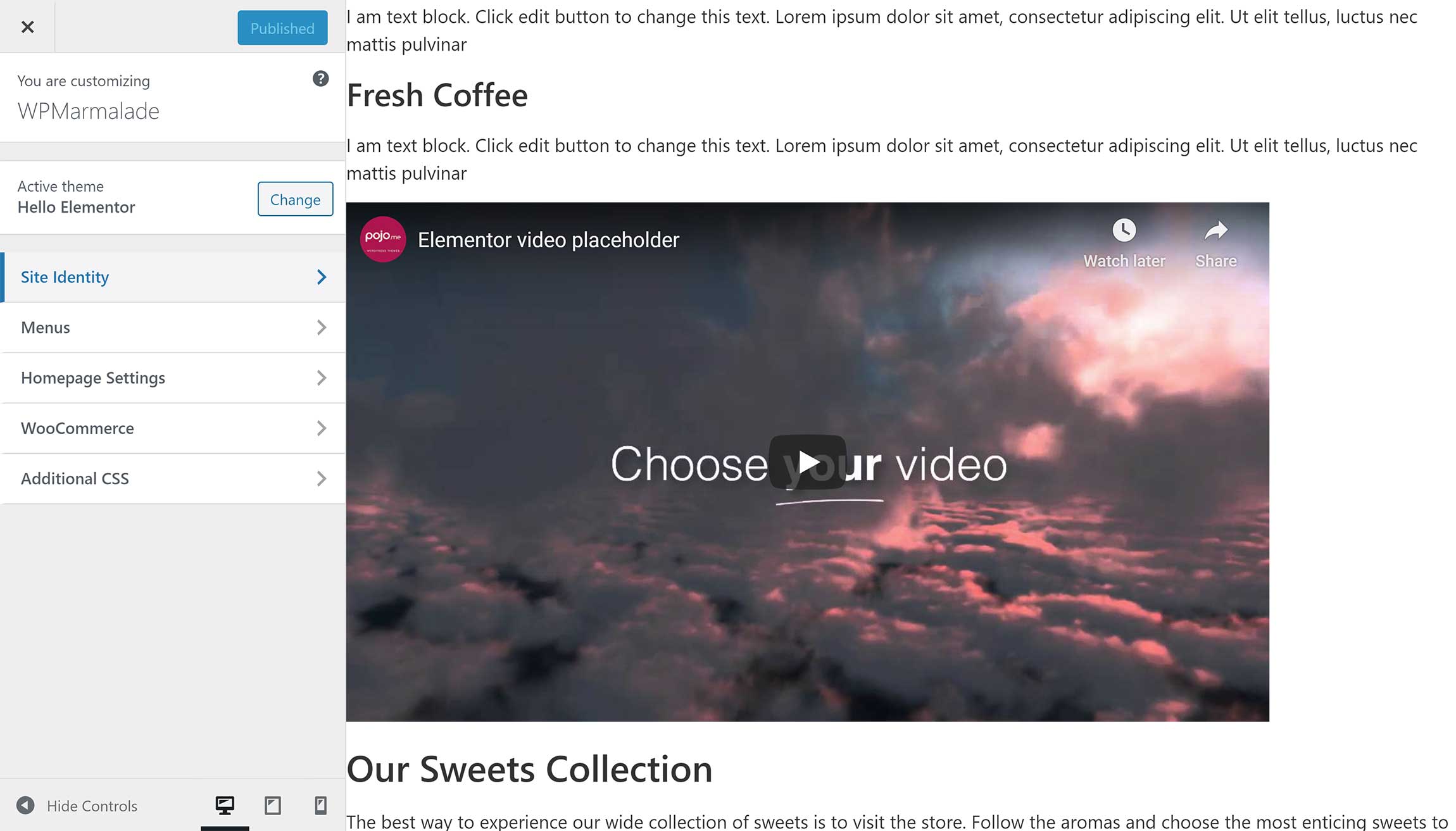
To help you to get the most from Elementor, the developers released a minimal theme for it called Hello Theme, which is free to download from WordPress.org.
Hello is the definition of a lightweight theme.
There are no options and no features: it’s simply a fast-loading framework that complements Elementor.
Divi Theme and Hello Theme can both be used with WordPress page builders, but they do things very differently.
Divi Theme can be used to change your website’s colors, size, margins and typography.
In contrast, Hello Theme is just a simple blank canvas. Therefore, all design customizations happen inside Elementor’s page-building interface.
Settings & Customization
Divi and Elementor both have a number of configuration options inside and outside their respective page builders.
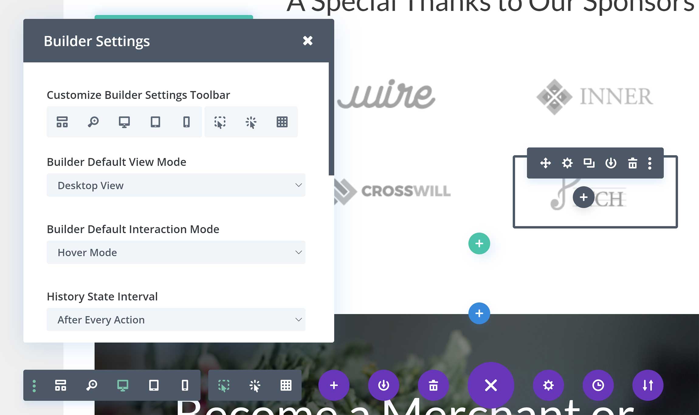
I believe most users will be happy with the way Divi Builder works out of the box. However, you can change editor settings by clicking on the three vertical dots at the far left-hand side of the main menu.
The builder settings menu lets you add three additional editing modes: Hover mode, click mode and grid mode.
Other settings include the default view mode, history state interval, page creation flow and interface animations.
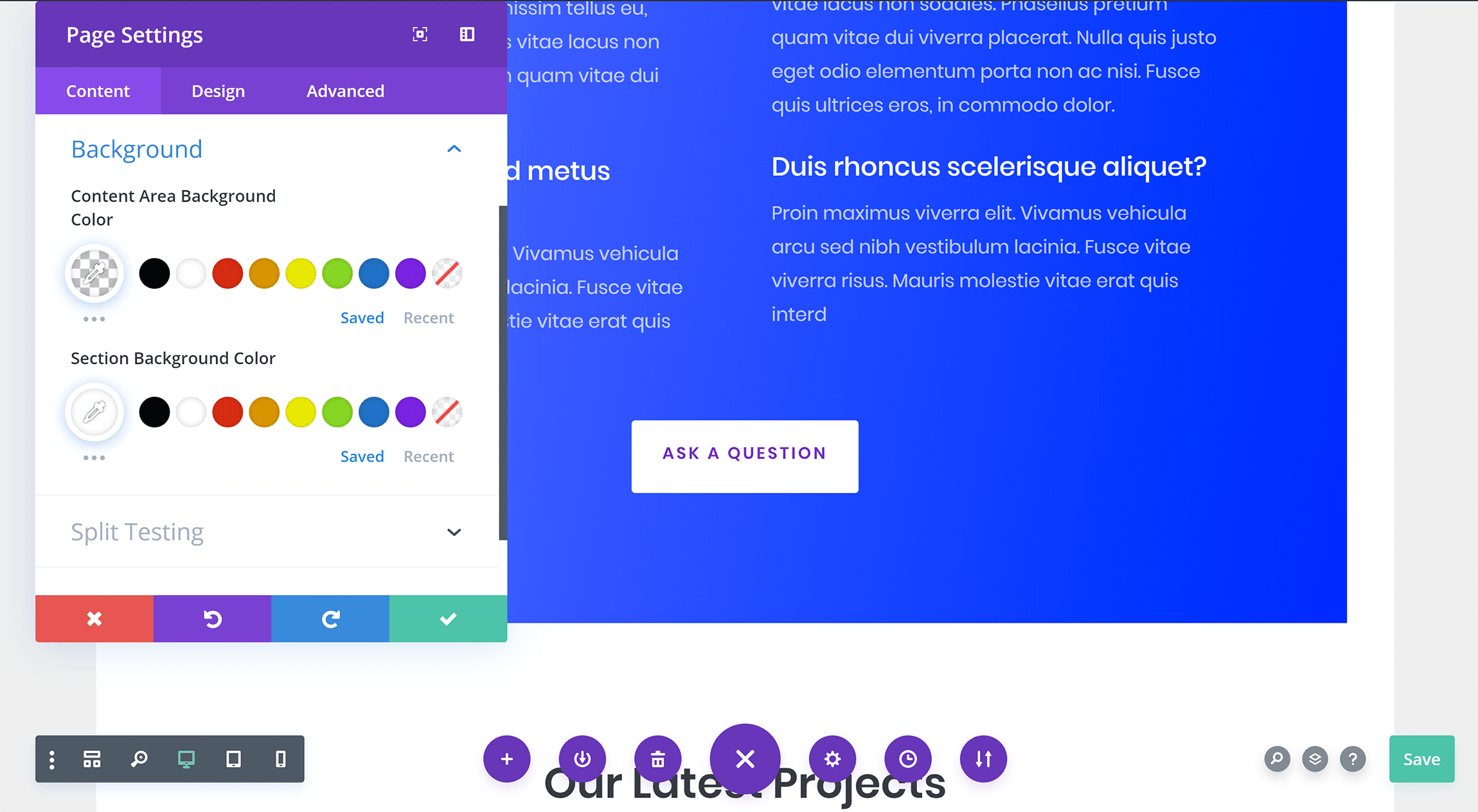
Page settings can be adjusted by clicking on the cog icon in the middle of the Divi Builder main menu.
This box lets you change the page title, excerpt and featured image. Dozens of design settings can be adjusted here too, such as the background colors, spacing, text and custom CSS.
You can also define visibility settings here and enable split testing.
Your Elegant Themes username and API key have to be entered in the Divi Builder options page to receive automatic updates.
In this options area, you can also enter your Google API key for Google Maps, select what post types Divi Builder is available for and enable CSS and Javascript minification.
All of these options and more are available in the Divi Theme options page, which I showed earlier.

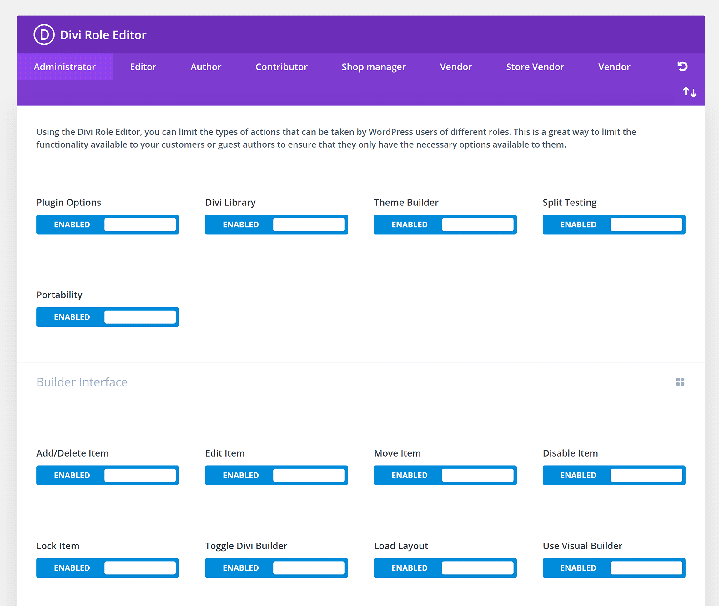
Divi’s built-in role editor can be used to define exactly who can and can’t use Divi.
You can specify whether WordPress user groups can access Divi Builder, Divi Library, settings, modules, support and more.
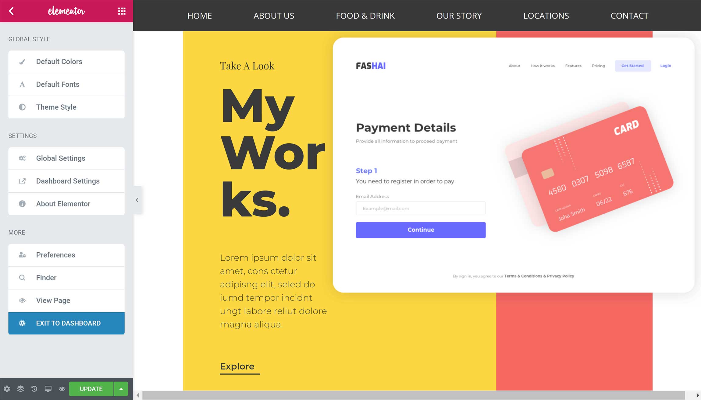
If you click on the top-left of the Elementor panel, the main settings area will be displayed.
From here, you can change the default colors and default fonts, while theme style shows dozens of styling settings for your background, typography, buttons, form fields, images and custom CSS.
This area also hosts global style settings, and your preference for the panel being white or black.
The bottom-left of the Elementor panel links to the page settings menu.
You can use this menu to change the page title, page status, page layout and background type. Custom CSS can be added too.

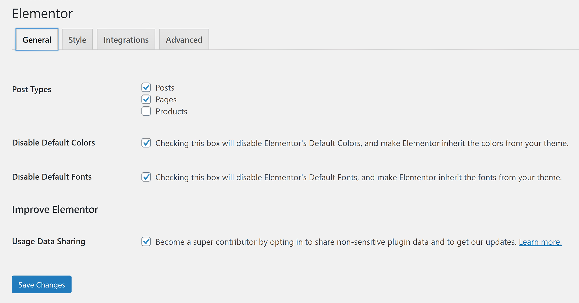
Other Elementor settings are split between two settings areas.
The main settings area is where you can set which post types Elementor works with, the break-point for mobile devices and API keys.
The tools settings area has various tools such as a safe mode, version control and maintenance mode.
Elementor Pro also adds settings pages for custom fonts and custom icons.
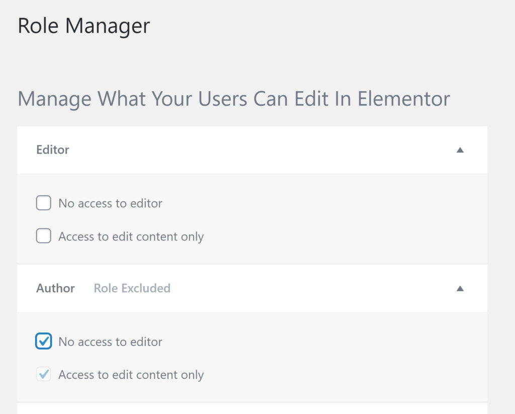
Elementor’s role editor is only available in Elementor Pro.
For each WordPress user group, you can choose to restrict access completely or restrict access to editing content only (i.e. no access to settings).
Both Divi and Elementor provide system information to help you to debug problems, and they also have a built-in support area with links to useful support videos and documentation.
The Cost of Divi & Elementor
Cost is something that needs to be considered for every project.
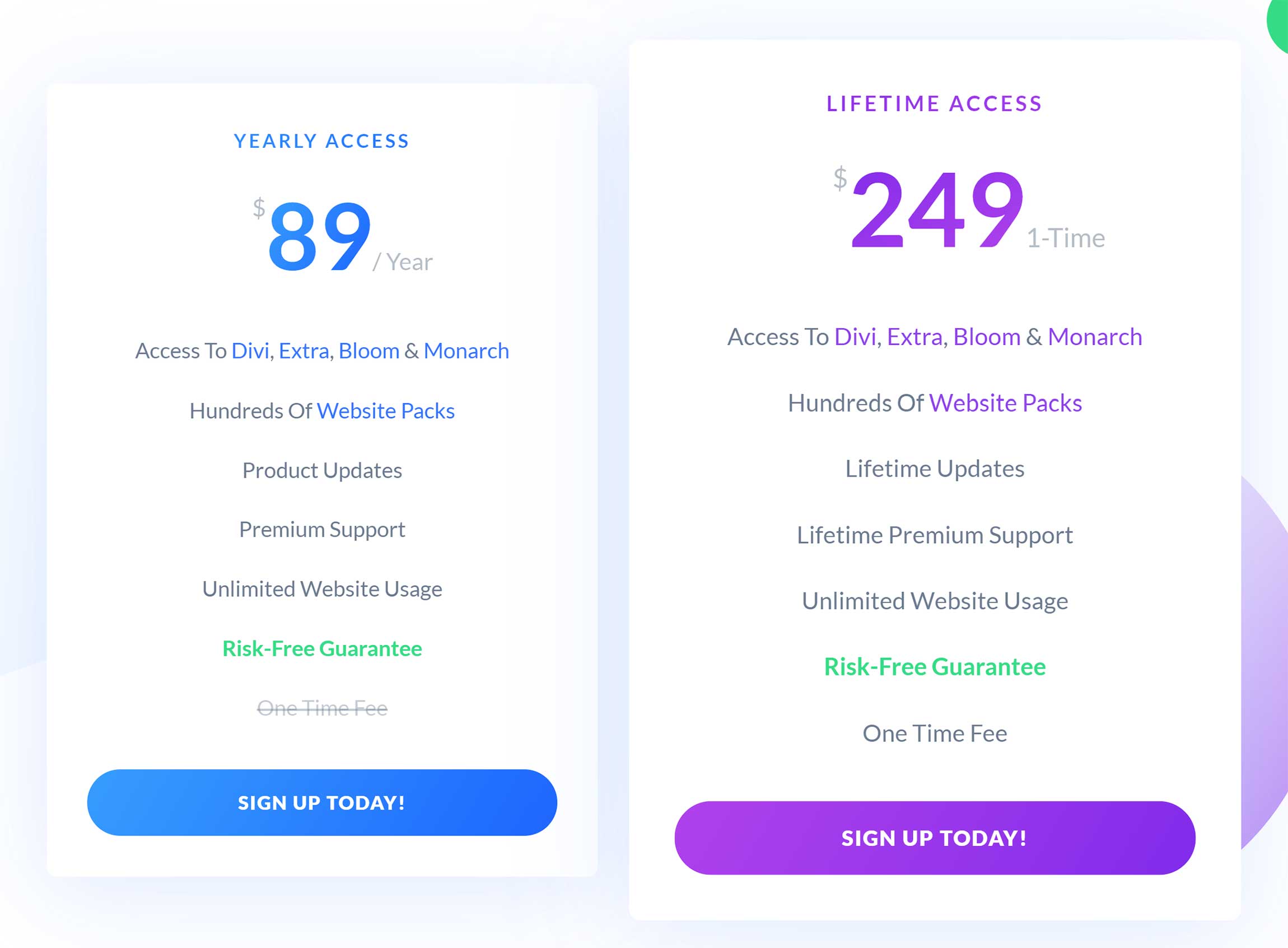
Elegant Themes has a simple pricing scheme for its membership: You can choose to pay $89 per year or pay a one-off fee of $249.
Each license grants unlimited website usage and support.
In addition to Divi Theme and Divi Builder, an Elegant Themes membership grants you access to the magazine WordPress theme Extra, the email optin WordPress plugin Bloom and the social media WordPress plugin Monarch.
One of the best-selling points of Elementor is that it can be downloaded free of charge.
The developers have been generous with what’s included in the core version, offering access to 47 widgets and more than a hundred layouts and blocks.
The cost of Elementor Pro depends on the number of websites you want support and updates for.
It costs $49 a year for one website, $99 a year for three websites and $199 a year for a thousand websites.
Upgrading gives you access to twice as many widgets, more than 300 additional Pro templates and advanced features such as the Elementor theme builder, WooCommerce Builder and pop-up builder.
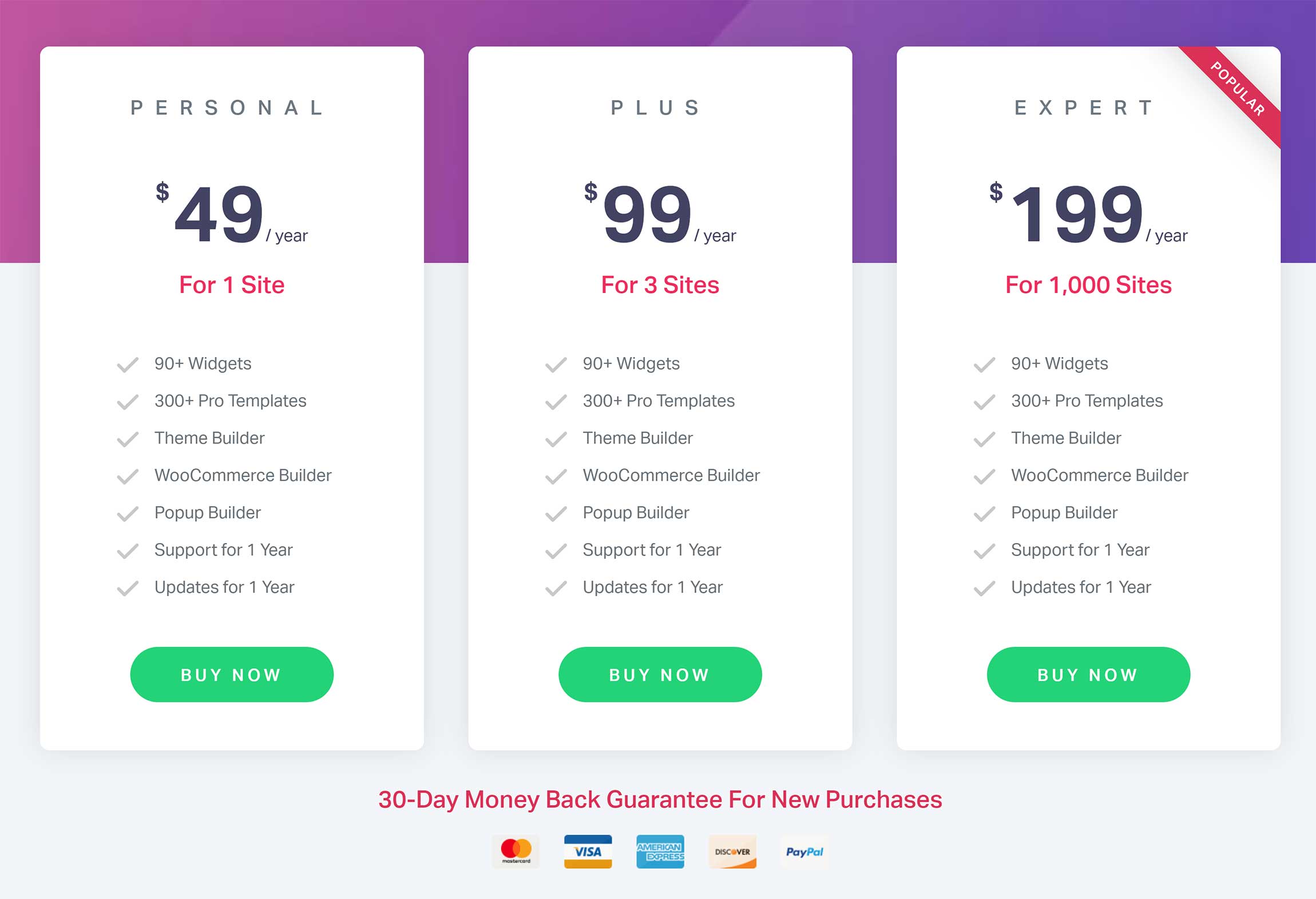
Both Divi and Elementor come with a 30-day money-back guarantee, and they also provide email support and an extensive documentation area that walks you through all features.
Final Thoughts
I’ve tested all major page builders on the market and, in my opinion, the best two solutions available to WordPress users are Divi and Elementor.
As far as features and functionality go, these WordPress plugins have many things in common. However, the process of creating layouts is different.
I recommend testing Divi using the Elegant Themes Demo page to get a better understanding of what it can do. You can test Elementor by installing the free version of the WordPress plugin.
Value is something that’s difficult to quantify, but, from a cost point of view, Elementor is the clear winner.
It can be downloaded free of charge, and there are many free third-party WordPress plugins that add more widgets, features and functionality.
Long-term, you may want to upgrade to Elementor Pro, as it adds more widgets, layouts and features.
If you only have one website, Elementor Pro is the cheapest option at only $49 a year.
For two websites and more, Divi is not only cheaper, but is arguably a better package overall, due to the additional theme and plugins that are included in the Elegant Themes membership.
Take all of this into consideration when you’re reviewing both solutions.
Used/using either Divi or Elementor? Thoughts?
Related Reading:
Discover more from WPMarmalade
Subscribe to get the latest posts sent to your email.


1 Comment
Unlike Elementor/Beaver, Divi Builder Custom CSS is “easy-but-not-powerful”.
You cannot easily style bullet/numbering inside rich text editor. You need another element only to style that bullet/numbering.
This is embarrassing. Even incomplete Gutenberg has powerful Custom CSS.