Most WordPress users know Elegant Themes for its massively popular Divi theme. But did you know the Divi theme has a sibling called Extra?
Extra offers a lot of the same features people love about Divi: You get the same visual drag-and-drop builder, and you get all of those same code-free customization options… but in a slightly different package with a different look. Overall, with its magazine design, Extra is more suited towards bloggers and publishers, though the differences between Extra vs Divi aren’t as large as they once were.
💡 Interested in reading more about Elegant Themes and all they have to offer? Check out our Elegant Themes Review.
In this hands-on Extra review, I’ll take you through everything you need to know about this theme. I’ll show you its features and how it works, and I’ll also help you to decide if and when you should choose the Extra theme over its more popular sibling, Divi (or if you should use the Extra theme at all).
Table of Contents
A Quick Overview of the Extra Theme
Extra is a flexible magazine theme from Elegant Themes. If you’re not familiar with the term, magazine themes do a good job of displaying lots of content, which makes them well-suited to bloggers, publishers and other media companies.
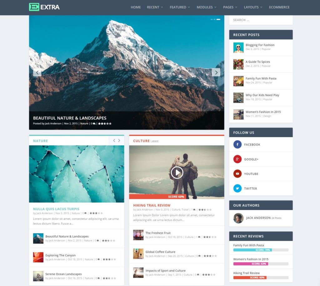
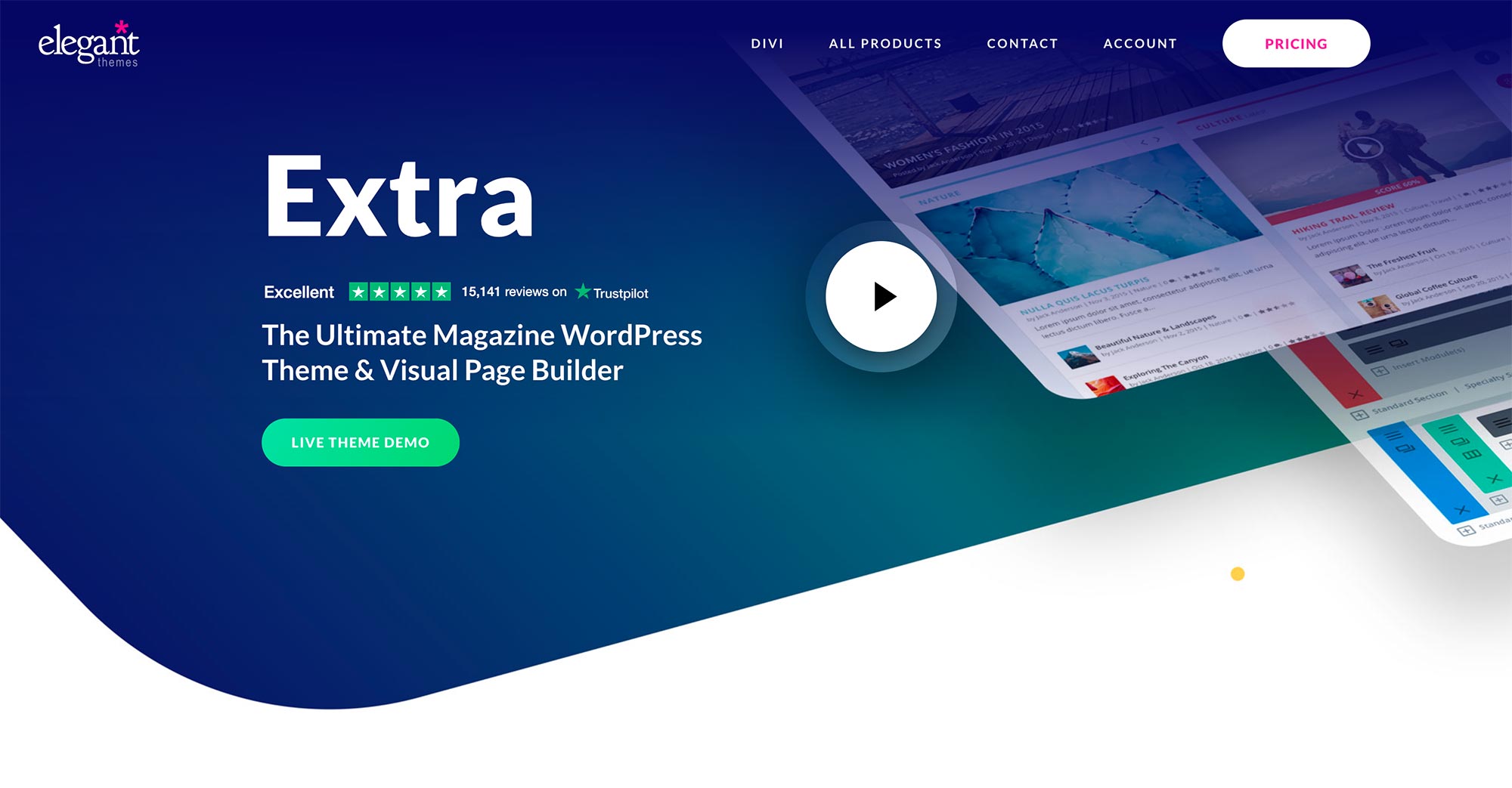
You can see the ‘magazine’ effect in the demo. Notice how there are separate boxes to display content from different categories? This makes it very easy for readers to browse all of your content to quickly find what they’re interested in:
Extra even comes with its own tool to help you to design the different grid items that display content from different categories (more on that later).
One of the most unique things about the Extra theme is it comes bundled with the Divi Builder, which is a visual drag-and-drop builder that lets you create 100% custom designs with zero code/technical knowledge (it’s also the exact same builder in the eponymous Divi theme).
You’ll also get a bunch of other useful features:
- Detailed customization options in the WordPress Customizer
- A custom theme options panel
- Custom category archive builder
- Built-in review box and user ratings features
- Social follow buttons
- Related posts
- WooCommerce support
Extra vs Divi
I can’t write a review of the Extra theme without mentioning Divi a lot because the two themes are so similar. Actually, not just ‘similar’, a lot of the defining features are identical.
This is because both themes are built on the exact same Divi Builder (which also comes in a plugin version) and the same basic theme options area.
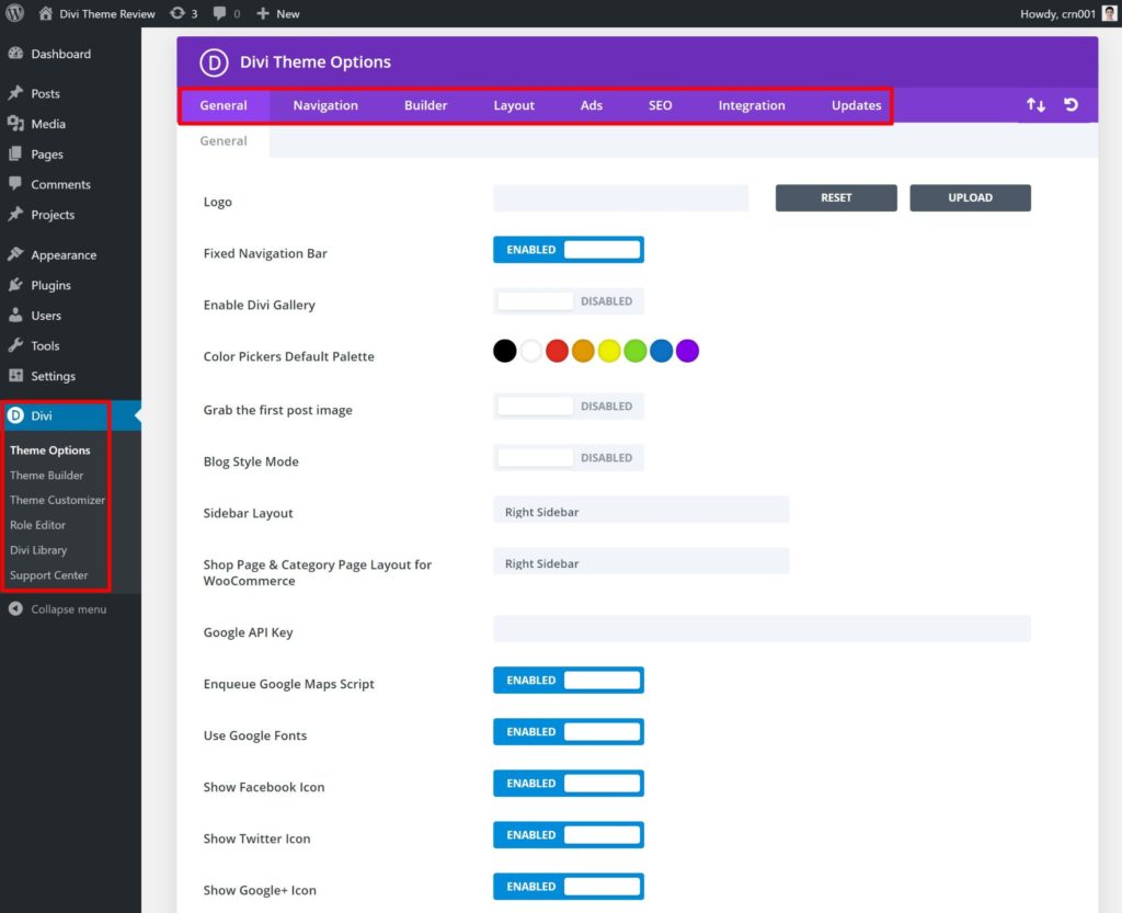
For example, here’s the Divi theme area:
And here’s a sneak peek of the Extra theme area:
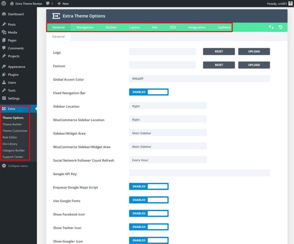
Notice some similarities? The menu areas are virtually identical, even down to the Projects custom post type both themes add.
The only difference in the menu options is that Extra adds a Category Builder, which I’ll cover later on. Of course, there are also different customization options inside the theme options and the WordPress Customizer — I’m just trying to show you that, at least at a high level, these themes are very similar.
Overall, the only real difference between Extra vs Divi is in the canvas for the Divi Builder designs you create:
- Extra is a magazine canvas for Divi Builder.
- Divi is a multipurpose canvas for Divi Builder (check out some examples of everything it can do).
However, the Divi Builder now includes full theme building (more on this later). With theme building, it essentially doesn’t matter what canvas your site has because you can replace every part of your theme using your own templates that you create with Divi Builder.
So, if you’re going to use the theme building feature in Divi Builder, there’s very little functional difference between Extra and Divi. If you’re not going to use that feature, then the only major difference is in the basic theme design, such as Extra’s default magazine looks.
How to Use the Extra Theme
There are a few different ways you can control the Extra theme:
- WordPress Customizer controls
- Theme options
- Divi Builder
- Category Builder
- Divi theme builder
Let’s go through how they work…
Using the WordPress Customizer to Control Your Canvas
Extra uses the native WordPress Customizer to control most of its front-end design options. This is where you can control your site’s layouts, typography, colors and so on. Here are some examples of the specific elements you can control:
- Header and navigation menus
- Content width
- Fonts
- Sidebars
- Colors for everything
- Button styles
- Social media networks (for follow buttons)
- Footer style/content
For example, in the general layout settings, you can control the width of your site and/or enable a boxed layout:
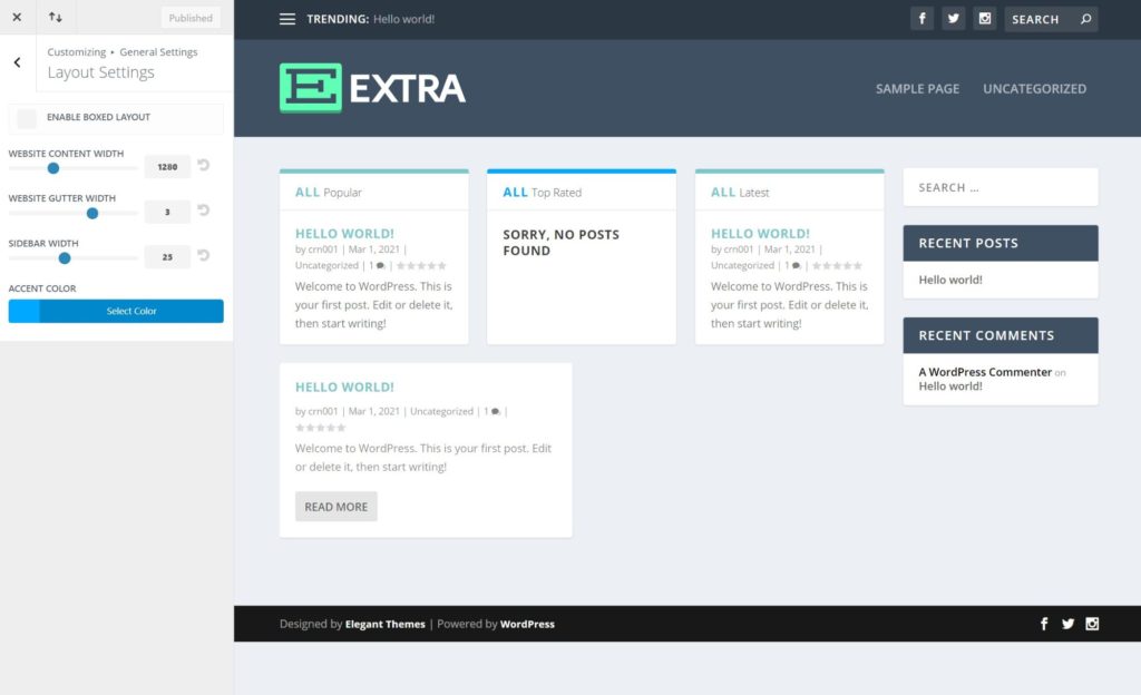
In the primary menu bar settings, you can change all of the colors and fonts, hide the logo and more.
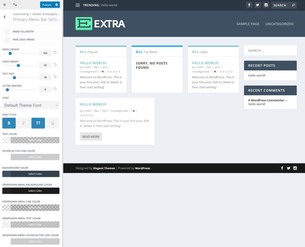
Overall, you get a lot of customization options, and, because it’s the native Customizer, you’ll see your changes on the live preview right away.
If you want to see everything in action, check out the video below:
Configuring Additional Options in the Theme Options
In addition to the Customizer settings, Extra also gives you a lot of options in its custom theme options panel, which I gave you a peek at earlier.
There is some overlap between the options here and those in the Customizer. For example, the theme options area also gives you an option to add your social media networks. However, there are also lots of unique options.
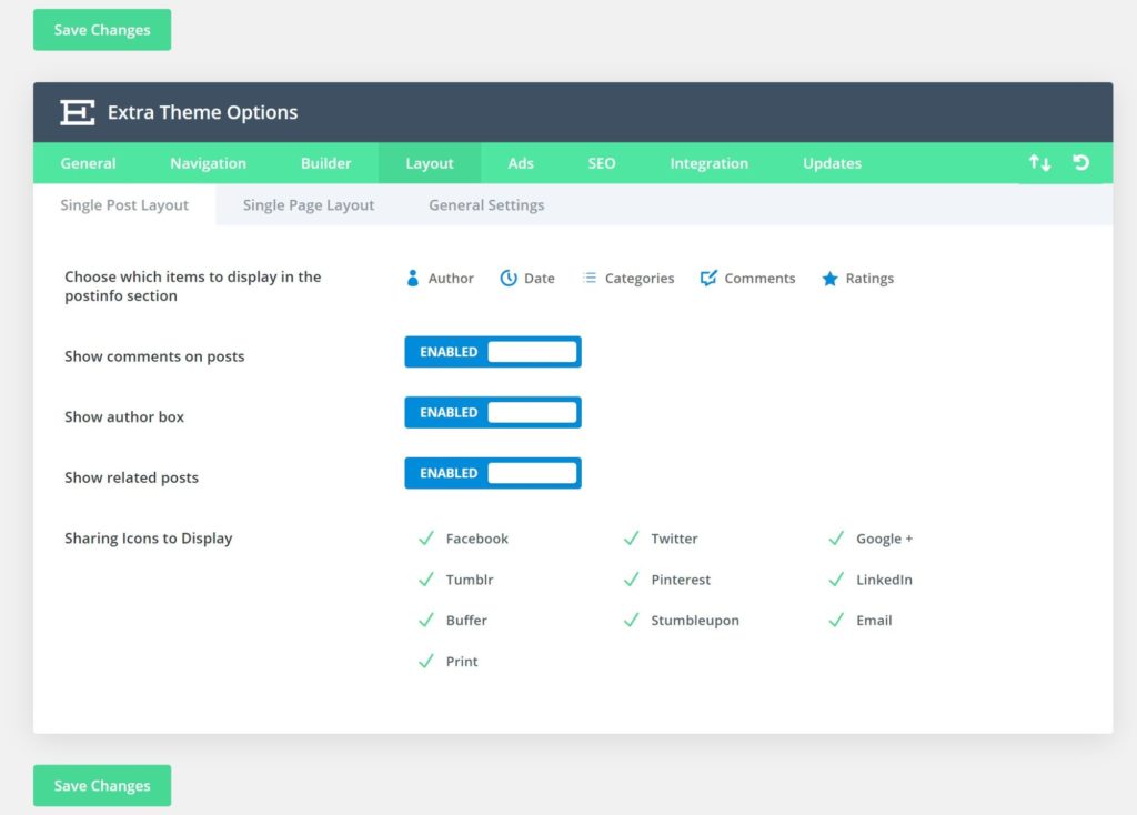
For example, the Layout tab lets you control what content to display on blog posts. There are also two unique features to display related posts and social media share buttons, all without the need for a separate plugin:
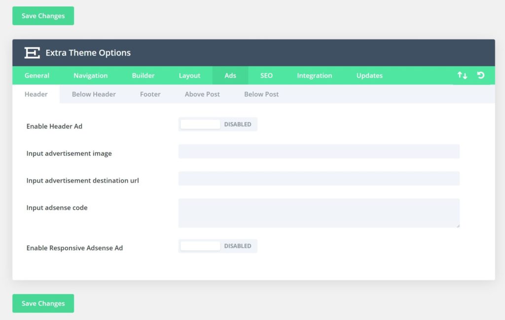
Extra also includes a bunch of built-in advertising slots, which lets you easily monetize your site using custom ads or AdSense in the following locations:
- Header
- Below header
- Footer
- Above post
- Below post
You can enable/disable all of these ad spots from the Ads tab:
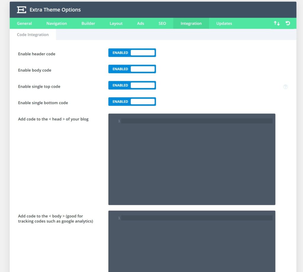
Finally, Extra also includes a useful feature that lets you inject code snippets at various parts of your site. This is useful for setting up tools such as analytics tracking, third-party popup tools, and so on.
Creating Content With Divi Builder
As with Divi, the most unique feature in Extra is the bundled Divi Builder, which is what takes Extra from ‘just another magazine theme’ to a ‘uniquely customizable magazine theme’. Without needing any code, you can easily set up custom layouts and add a variety of content elements using modules.
You can use the core Divi Builder to edit posts, pages and custom post types. Here are some example use cases:
- Create a custom homepage
- Build landing pages
- Create more styled, engaging blog posts
- Build out your core pages (About, Contact, etc.)
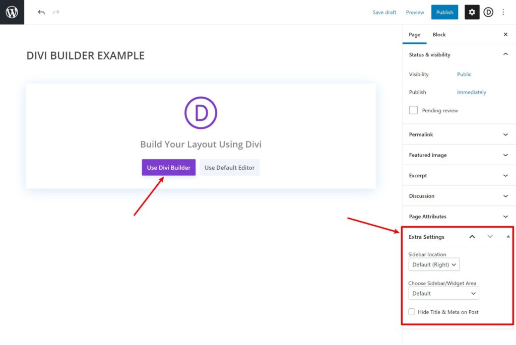
You can launch the Divi Builder from the editor for any post, page or custom post type, and, while in the editor, Extra also gives you some page-level settings to control the canvas for your builder design. For example, you can change/disable sidebars and hide the title:
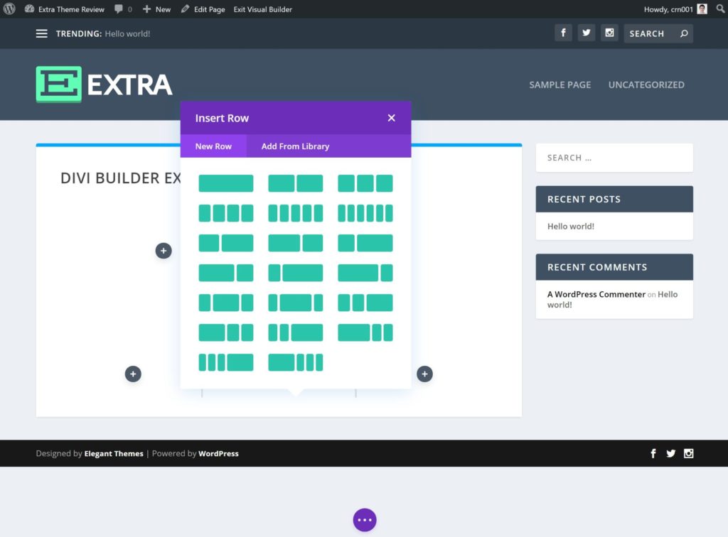
When you launch the builder, you’ll see a live preview of your site along with options to control your design. You can create rows and columns to control the layout of your design:
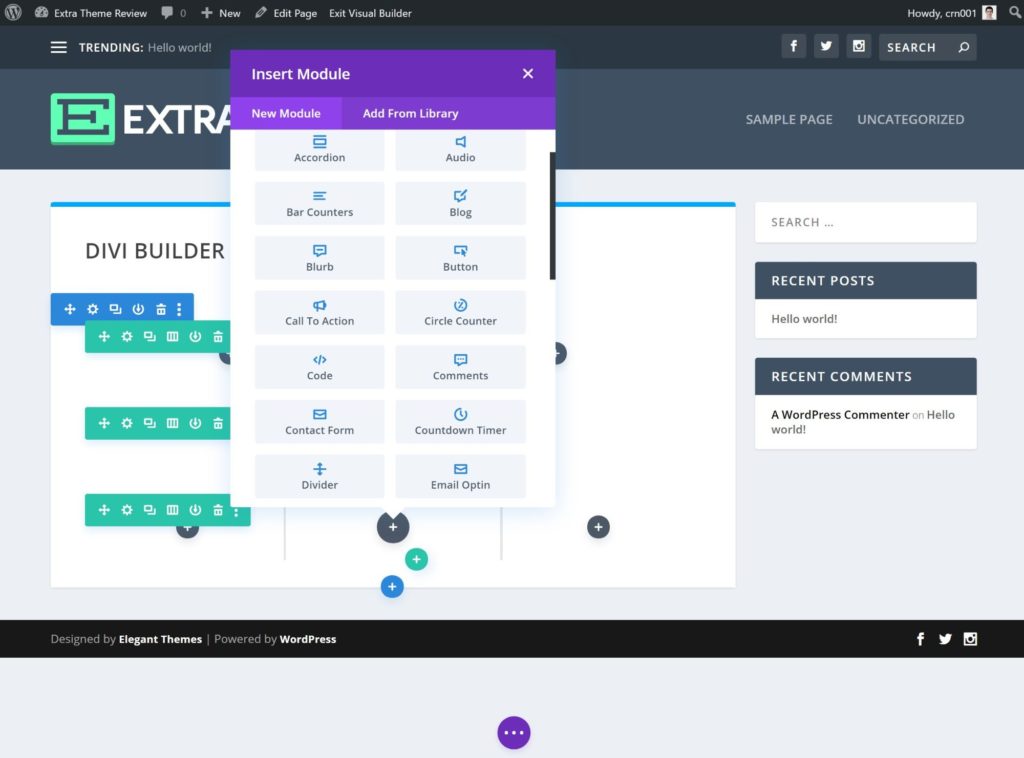
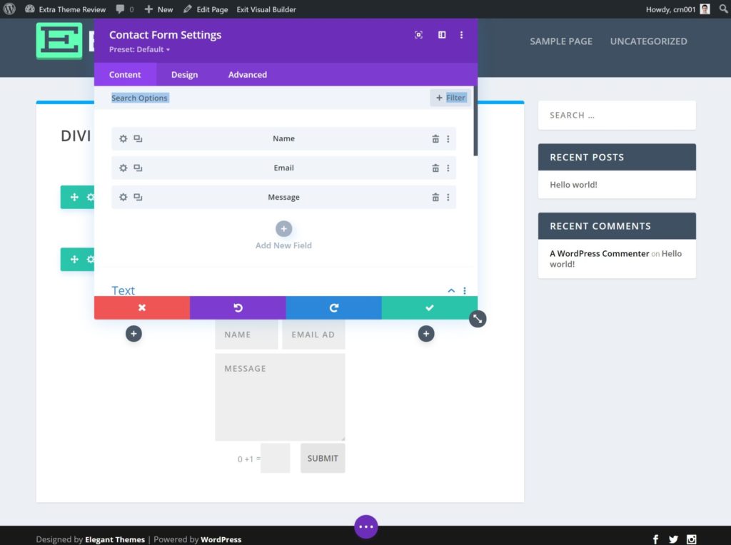
Then, you can add content using modules. You’ll get modules for simple elements such as text, images and buttons, as well as more advanced elements such as sliders, forms, countdown timers, testimonials and more:
For every row, column, and module, you’ll also get detailed settings to control that element’s content, design, layout, and so on. To edit text content, you can also just click on the page and type.
Building your designs from scratch can feel overwhelming sometimes, so, if you want a helping hand, Extra also comes with more than 1,488 pre-built templates, divided into 202 themed layout packs. These are the exact same templates you get with Divi — they’re not unique to Extra:
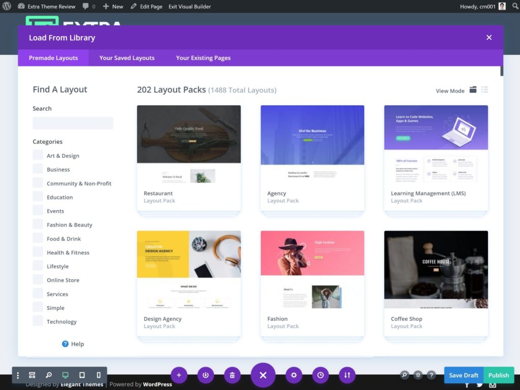
You can also save your own designs as templates to reuse them later.
Honestly, the Divi Builder is an incredibly powerful tool that requires a whole review of its own, so I can’t show you everything this builder lets you do. However, I can give you a chance to try it for yourself. To play around with a full-featured live demo, just click the button below:
Using the Custom Category Layout Builder
One of Extra’s most unique features is its category layout builder, which lets you design the pages that list your blog posts using a visual editor (in technical terms, these pages are called your ‘Archive’ layout). What’s really cool is you can create different layouts for your main blog page or for individual categories. For example, you could have one layout to list posts in the ‘Reviews’ category and another layout to list posts from the ‘News’ category.
You can access this tool by going to Extra → Category Builder. By default, Extra comes with one layout for the magazine grid on the front page and another default layout for categories:
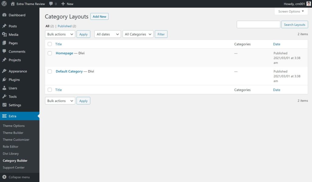
If you create a new layout or edit one of these existing layouts, you can use the back-end wireframe version of the Divi Builder to control the layout using some special modules. You’ll get the following dedicated modules:
- Featured post slider
- Masonry list of blog posts
- Basic list of blog posts with images
- Basic text list of blog posts
- Tabbed list of blog posts
You can also insert ads, as well as generic text and images:
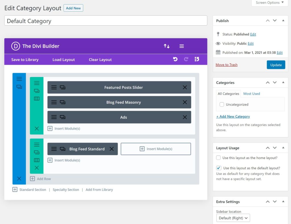
For each blog list module, you can tell it to only display posts from specific categories, and you can also have it ignore any posts that have already been displayed, to prevent issues with duplicate content from overlapping categories:
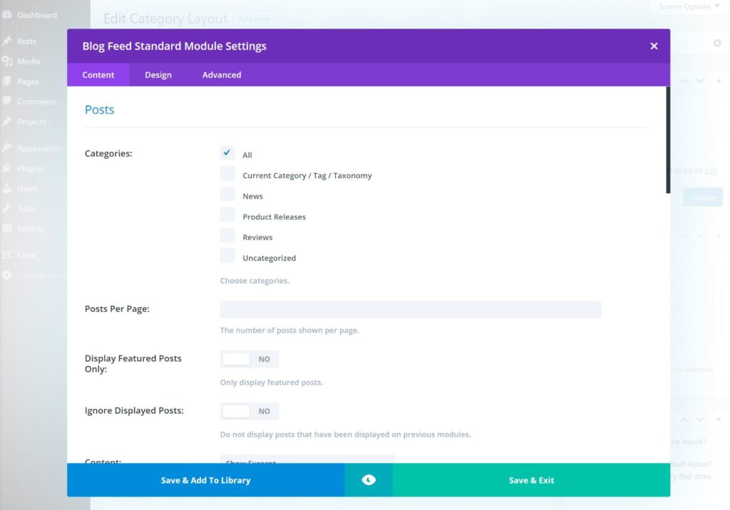
Essentially, this lets you create your own magazine effect and easily control which posts display where.
If I wrote this Extra theme review a year ago, I would’ve said this feature was super valuable. It still is valuable, but it’s no longer quite as unique since Divi Builder added full theme building, which is also included in Extra. So let’s talk about that next…
Using Full Theme Building With Divi Builder
In Divi 4.0, Elegant Themes added full theme building support to the Divi Builder, including the version bundled in Extra.
If you’re not familiar with theme building, it lets you use the same visual drag-and-drop builder you saw above to design your theme’s template files, including the templates for your site’s:
- header
- footer
- archives (e.g. the page that lists your blog posts)
- singles (e.g. the template for individual blog posts).
For example, if you don’t like the built-in header options for Extra, you can use the theme builder to design a completely new header using drag and drop, and display it site-wide (or only on specific content).
It’s kind of the same idea as the category layout builder… but it applies to every part of your theme, instead of just your category layouts. This is also why I no longer think the category layout builder is that special — why use the category layout builder when you can already do it using the Divi theme builder? Plus, the Divi theme builder lets you work from the front-end editor, instead of the back-end wireframe editor you’re limited to with Extra’s built-in category layout builder.
You can control all of your theme builder templates by going to Extra → Theme Builder.
Extra will add one default set of templates. Each template includes a header, body (the main content) and footer.
The most useful thing, though, is you can also create your own templates and conditionally apply them to different parts of your site using a ton of different filters. You can target content from specific:
- categories
- tags
- authors
- date ranges
- post types
- etc.
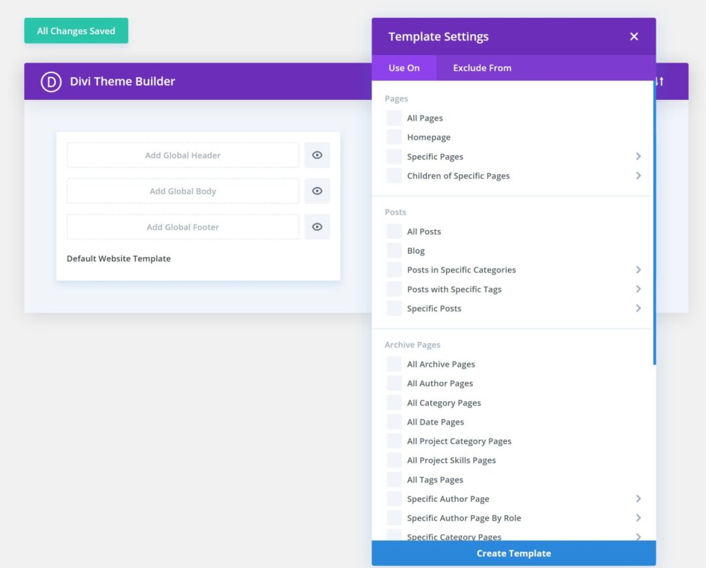
For example, instead of using Extra’s category layout builder, you could create a new theme builder template for posts in a certain category. Then, you could use the visual builder to design the template for your category archive using the Blog module or Post Slider module. Elegant Themes has a great tutorial on how to do this:
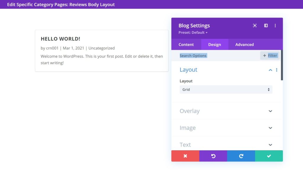
Overall, Extra’s dedicated category layout builder is still a bit more flexible than the theme builder when it comes to archive pages. However, the theme builder will work for most people, and it also gives a lot more control because you get to use the full Divi Builder front-end interface.
To learn more about the Divi theme builder, check out this video:
Exploring Some Other Features in Extra
In addition to the big features I detailed above, Extra also includes a few other goodies you may find useful.
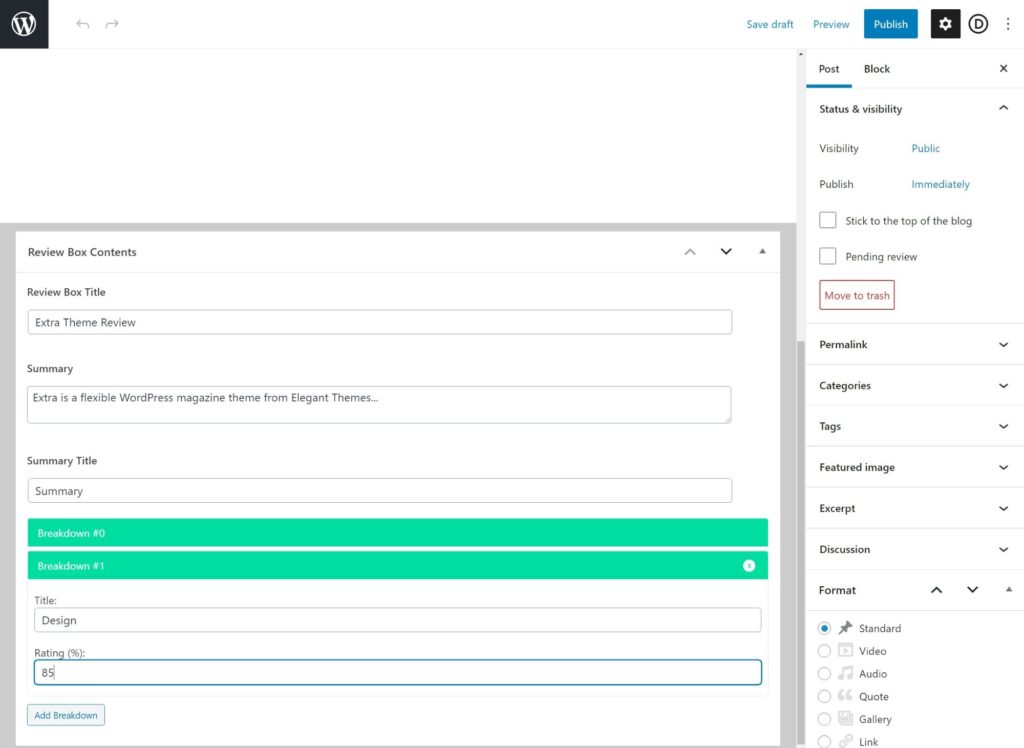
First off, Extra comes with its own review system, which lets you add your own review summary boxes and accept user reviews without the need for a third-party review plugin. This is another unique feature you don’t get in Divi.
When you create a blog post, you’ll get a new Review Box Contents area where you can add review information, including as many scores as you want:
Users can also submit their own ratings on posts from the front end (though you have the option to disable this feature in the sidebar). You can check it out in this video:
This feature is useful, but I’m a bit wary of having this as a built-in theme feature because of lock-in. With this approach, all of your review content is locked in to the Extra theme, which means you’ll lose it if you ever switch themes (or you’ll need to manually migrate it). For this reason, I think it would actually be better to use a separate review plugin for data portability unless you’re 100% certain you’re never going to switch away from the Extra theme.
Beyond the review feature, Extra also comes with its own set of widgets that you can add to your sidebar or footer, including some useful options such as social follow buttons, ads and recent Tweets:
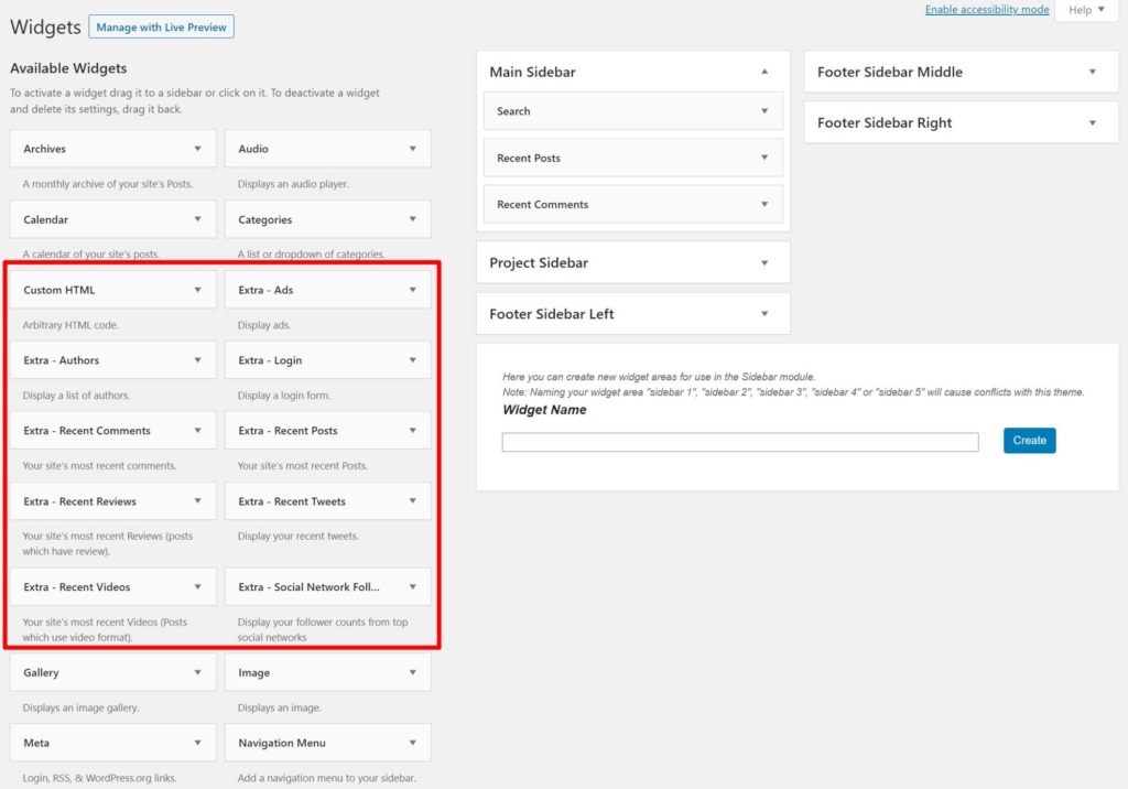
Finally, as I mentioned earlier, you also get built-in features for related posts and share buttons, which further eliminate the need to use third-party plugins.
Extra Theme Performance Tests
If you want your website to load fast, it’s important to choose a performance-optimized WordPress theme.
First, the bad news — the Extra theme is definitely not the most lightweight WordPress theme I’ve tested, which is true of most of the Elegant Themes products.
When I tested a fresh install of the Extra theme, it was 554 KB with 26 HTTP requests, which is heavier than some of the popular performance-focused WordPress themes such as the below:
- Astra — 44 KB and 9 HTTP requests.
- GeneratePress — 26 KB and 7 HTTP requests.
- Neve — 32 KB and 8 HTTP requests.
- Kadence — 40 KB and 10 HTTP requests.
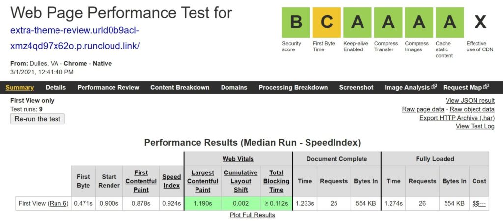
What’s responsible for the big difference? In large part, the fact that Extra loads the Divi Builder on all of its pages, which is what adds most of the weight.
However, there’s also some good news.
First off, if you’re planning to definitely use a visual builder, the difference between those other themes isn’t nearly as large. For example, if you pair Astra with the popular Elementor page builder, you’d be looking at more like ~250 KB and 25+ HTTP requests, which is a lot closer to where Extra is at.
Basically, the extra weight comes from the fact you have a visual drag-and-drop builder, and you’re going to have that extra ‘weight’ even if you were to add the builder in the form of a plugin instead.
Second, and this is the best news, it’s still totally possible to get a fast enough WordPress site with Extra, as long as you’re implementing WordPress performance best practices such as caching, fast hosting, code optimization, and so on.
Extra vs Divi Speed and Performance
Given that the main difference between Extra vs Divi is in the ‘foundation’ for your Divi Builder designs, I was curious how the Extra theme’s performance stacked up against the Divi theme’s performance.
To test this, I created a design with Divi Builder. Then, I tested that exact same design twice:
- Once with the Extra theme activated.
- Once with the Divi theme activated.
Basically, nothing is changing in the design itself — I’m just changing the ‘canvas’.
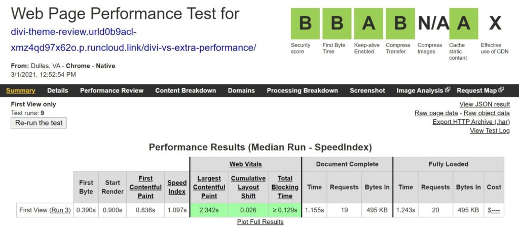
Here are the test results for the page using Extra:
And here are the test results for the page using Divi:
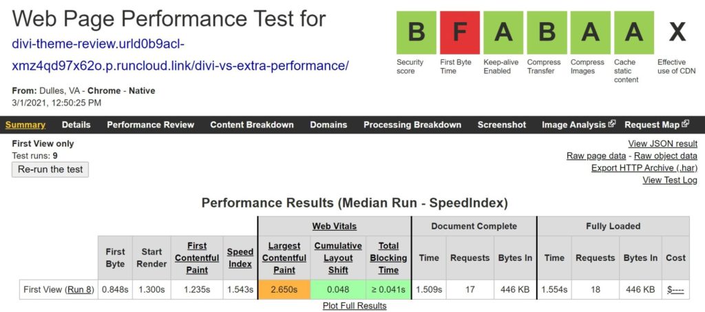
Verdict? The Divi theme is a little more lightweight than the Extra theme. Here are the ‘weights’ in table form:
| Page Size | HTTP Requests | |
|---|---|---|
| Extra | 495 KB | 20 |
| Divi | 446 KB | 18 |
In case you’re wondering, I dug into the waterfall and found that the extra weight mostly came from:
- One extra JavaScript script for Extra’s masonry grid.
- One extra font for the custom Extra font.
Overall, it’s pretty safe to think of Divi and Extra as being roughly equivalent in terms of performance, though Divi does have a slight edge.
Extra Theme Pricing
Purchasing the Extra theme is a little tricky because you can’t purchase it by itself. Instead, it’s only available as part of the Elegant Themes membership, which gets you access to all of the products Elegant Themes offers, including the following:
- Extra theme
- Divi theme
- Divi Builder plugin version
- Monarch plugin (social share/follow buttons — read our review)
- Bloom plugin (email opt-in forms/popups)
You can either purchase a one-year membership or a lifetime membership:
- One year — $89
- Lifetime — $249
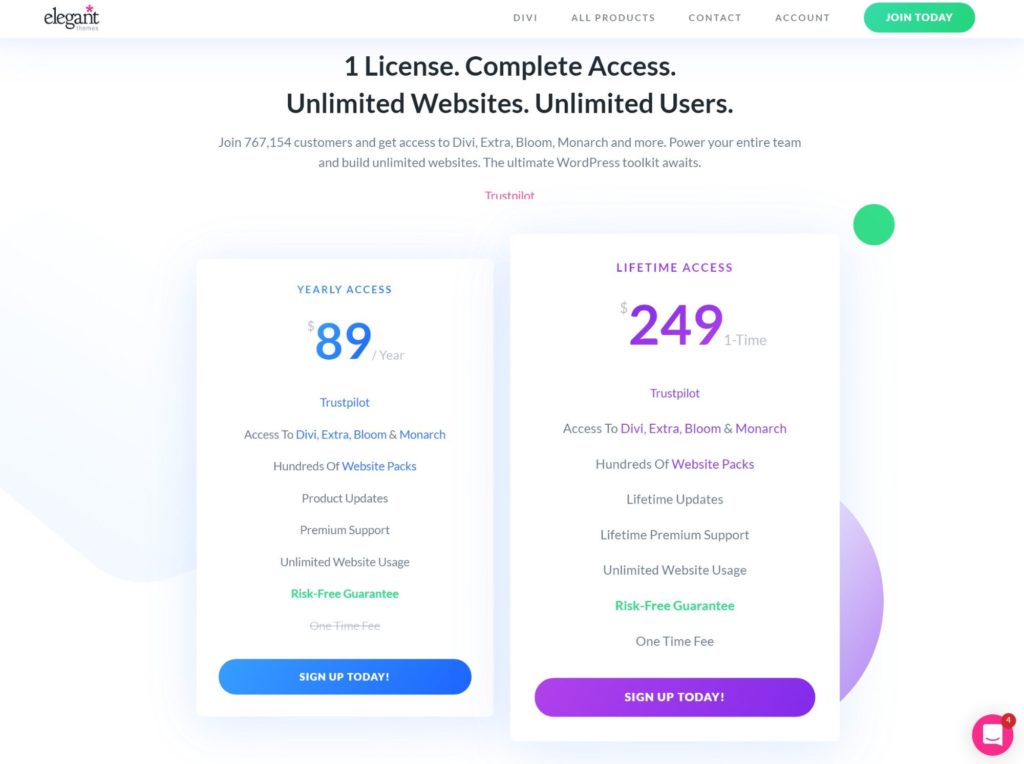
You can use all of these tools on unlimited personal and client websites. If you’re going to use multiple tools and/or create multiple websites, the Elegant Themes membership offers pretty incredible value.
On the other hand, if you’re only going to use the Extra theme on a single website, it’s a little expensive compared with another standalone theme, which would typically cost more like $60.
Should You Use the Extra Theme?
Overall, I think Extra only fits a small subset of people. Not because Extra is bad, just because Divi can already do almost everything Extra can. So, if you want a theme with these features, why not use Divi since Divi is a lot more popular?
That doesn’t mean you should never use Extra. It just means there are lots of situations in which Divi might be a better option.
In my mind, the only reason to use the Extra theme over Divi is if you absolutely love the default Extra styling and want its out-of-the-box magazine layouts. If you publish a lot of content, you may prefer Extra’s default looks to Divi’s looks, in which case it’s a great option.
On the other hand, if you’re mainly attracted because you want the ability to create a 100% custom website using drag and drop, then just use the Divi theme. Now Divi has full theme building, you can pretty much make it do almost everything the Extra theme can do (you could even turn it into a magazine theme). Divi is more popular, which means it’s easier to find help, and it’s also a little bit more lightweight, which means your site will load faster (though the difference isn’t huge).
Here’s the great thing, though:
You get both themes as part of the Elegant Themes membership, so you don’t have to choose right now! So, if you like the idea of the bundled, visual drag-and-drop editor, but aren’t sure whether to go with Extra or Divi, here’s my recommendation:
- Purchase the Elegant Themes membership.
- Install Extra on one website and Divi on another site (you can easily use a tool such as Local or DevKinsta to create multiple test sites).
- Unless there’s a specific default style or customization option you absolutely love in Extra, just use Divi.
To test things out, you can view the Extra demo and play around with the live Divi Builder demo. Plus, the Elegant Themes membership offers a 30-day money-back guarantee, so you aren’t risking any money by purchasing it and experimenting with Extra and Divi.
Related Reading:
Used/using the Extra theme? Thoughts and experiences?
Discover more from WPMarmalade
Subscribe to get the latest posts sent to your email.

2 Comments
I’ve been using Extra fot a fairly busy entertainment site for quite a while now and my only complaint really is that you can’t use the Category Builder modules in the Theme Builder, nor and can’t use the standard modules in the Category Builder. Natively anyway.
I have been genuinely torn between these for a new blog site I’d like to start and another I’d like to transition from a free WP theme to, and hadn’t yet found a solid comparison or justification for using Extra that wasn’t four years old.
This was very helpful. After doing numerous sites in Divi, I’m probably going to go with Extra for at least one of these blogs, to at least try it out.
Thank you!
Matt